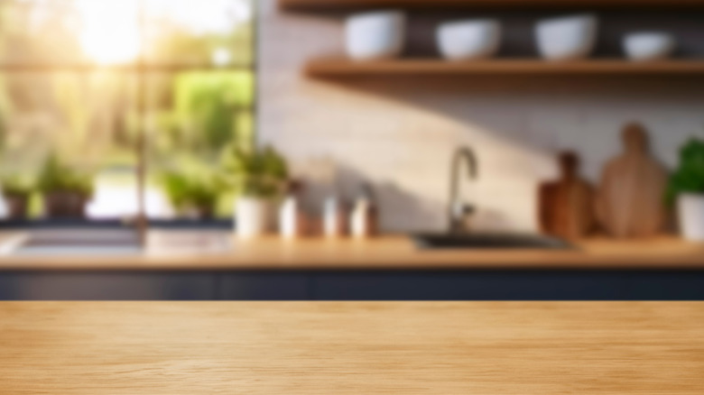
How To Paint Your Kitchen If You're Going For A Mid-Century Modern Design
We may receive a commission on purchases made from links.
Although vintage kitchen trends and grocery lists have changed mightily throughout the years, one thing hasn't changed much since the middle of the last century: the kitchen is the heart of the home. Making it a warm, safe, cozy place to cook is something that requires intention and purpose, especially if you're going to take on a challenge such as learning how to employ a mid-century modern aesthetic.
The good news is, with the right design, you can paint kitchen walls and other surfaces to great and lasting effect. "I've seen again and again that designs with emotional clarity and purpose hold up longer than anything driven by trend," says Hayley McAteer, interior designer and owner of Cushee. "These colors weren't just stylish in the 1950s, they were chosen to support how people lived. That same logic still applies in kitchens today."
It's less about one particular design choice and more about balance and restraint, says Iryna Kolosvetova, creative director at Fine Dining 4 Home. "Mid-century design is clean-lined, warm, and thoughtfully layered. It loves contrast, but never chaos," she says. Sometimes that means a simple linen table runner or textured ceramics, and sometimes it means a whole new wall color. If the latter is a step for which you're ready, it's time to take the mid-century modern painting plunge.
Understand the mid-century modern aesthetic
You may not care for nostalgic cakes, old-school icings, or other quirky 1950s food (ahoy there, molded Jello salads), but your kitchen can still take inspiration from the mid-century mindset. It's important to understand that mindset if you want to paint kitchen surfaces in a believable mid-century style, though.
So, what's the basic thinking behind the how-to? "Mid-century isn't a museum piece — it's a philosophy of restraint and purpose," explains Rachel Blindauer, principal interior designer at Rachel Blindauer. "One of the most common missteps with mid-century modern design is taking it too literally. People often default to orange wood, atomic prints, and mustard palettes without considering proportion or function." Rather, Blindauer says, you should imbibe the main drivers of mid-century design: innovation, integration, harmony, and clean lines. "The spirit is what matters, not the clichés."
To put it another way, says Teri Simone, head of Design and Marketing at Nieu Cabinet Doors, you can think of it as warm, lived-in minimalism. "It's not about recreating a 1950s space. It's about honoring the design style while still making it work for how you live today. Think clean lines, natural textures, and a bit of bold color or shape for personality."
If you know you like the vibe but aren't quite sure where to start, avoid the kitsch and do a bit of research. An informative coffee table book, such as "Mid-Century Modern Design: A Complete Sourcebook" or "Charles & Ray Eames: 1907-1978, 1912-1988: Pioneers of Mid-century Modernism," could prove your best friend.
Do an inventory of your current color scheme
Before diving into the real how-to of mid-century modern painting, it pays to review what parts of your existing design you like. It won't do, after all, to paint kitchen walls in colors that don't match what you already have, unless you feel like changing absolutely everything about the room.
So what exactly should you take stock of? In a word: everything, because paintable surfaces aren't the only ones in your kitchen. Making a mental map of every surface contributing visual stimulation to the space is a critical step in how to paint the room overall. Because mid-century modern is all about balance and simplicity, your goal is to paint kitchen walls and cabinets in such a way as to match your existing surfaces.
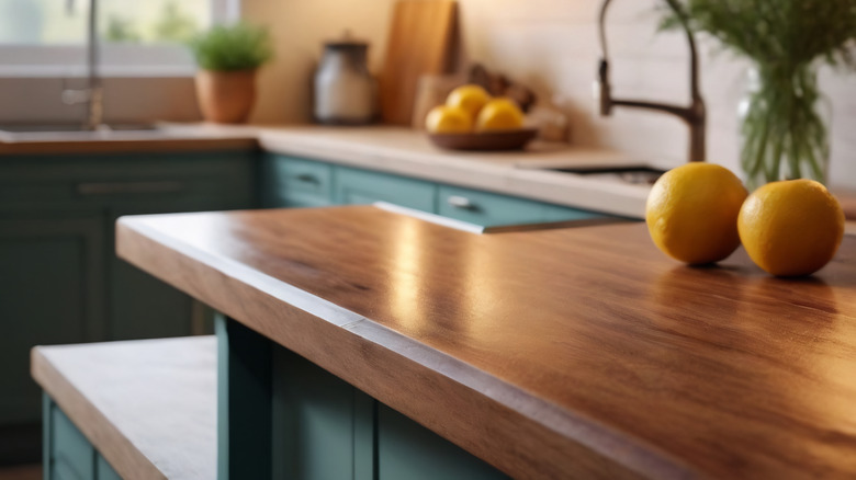
"Before selecting paint, you need to understand the tones already present," explains Arvid Lithander, creative director and co-founder of Wild Palace. He advises you look at the undertones of your countertops, the finish on your fixtures, and the materials of your appliances during your contemplation. Any wooden surfaces you won't be painting matter too, as their hue and glow will have to play nicely with your paint colors.
Don't forget to take stock of tiling or backsplashes, your floor, and movable items such as wooden stools. "Paint should work with those pieces, not fight them," Hayley McAteer says. "Skip this step, and things feel off or cost more later. I'll also ask clients what color shows up most in their home or closet. That usually gives us a clear direction."
Determine if you have a signature color
Before you paint kitchen walls or trim, ask yourself whether you have a signature color you should keep in mind. What is a signature color? IYKYK, but if you don't, it's that pop of vibrance that shows up here and there around your home and gives you joy when you see it. Chances are you're not choosing a new one, but identifying what you've already put in place.
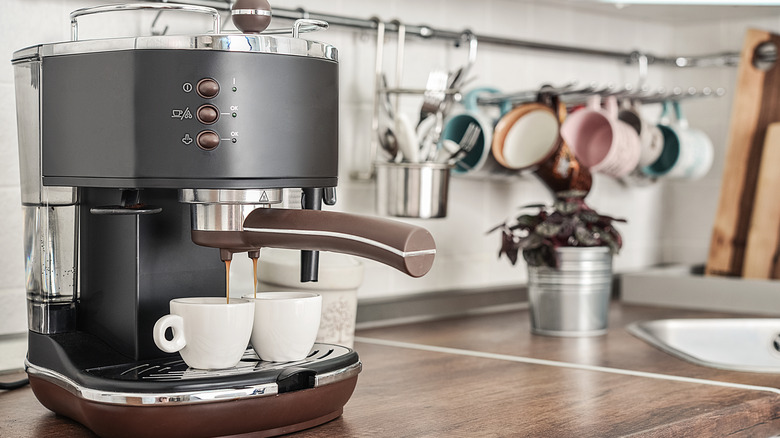
"From backsplash tile to barstools, your space already tells a visual story," Iryna Kolosvetova says. "Your signature color could be already there – maybe it's your vintage espresso machine or a stack of lemon-colored bowls. Look around and see what could spark the palette, then build your main color around it." Other places to look for it are in textiles or art, Teri Simone says. Note, adds Arvid Lithander, that "Your signature color might not be a bold hue, but a consistent undertone, like a warm brass, cool chrome, or soft wood. That should be honored rather than challenged."
If you'd like to choose a new signature color, that's fine, but make sure it doesn't clash with the décor you already have in place. Start to incorporate it in little elements around the room that stand out but don't make the space overly busy. For instance, a KitchenAid Classic Series Stand Mixer can be a great way to add visual interest. Plus, they're very useful for everything from cake to mashed potatoes, and they look really pretty on a countertop.
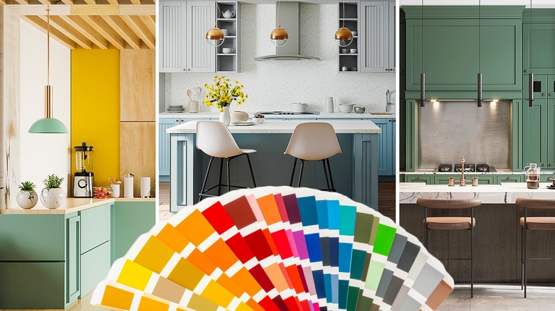
Play with mid-century modern hues
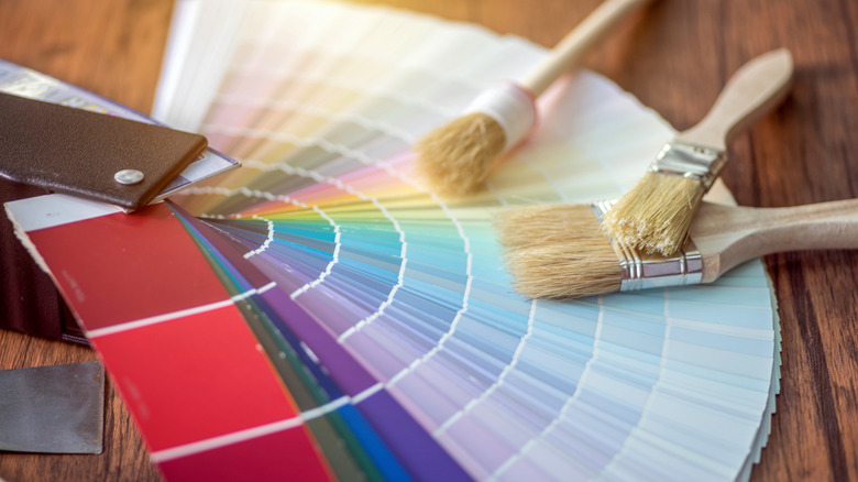
Before you pop off to the home improvement store and start painting kitchen surfaces willy-nilly, take the time to explore mid-century modern colors. You won't learn how to speak fluent mid-century modern overnight, but a bit of experimentation will help you get closer to the right result.
"For exploring colors, apps like Benjamin Moore's Color Portfolio or Sherwin-Williams' ColorSnap can be useful," Rachel Blindauer says. Even though they can't substitute for real, physical samples, it's a good place to start. Digital tools such as these "let you upload photos of your space and test-drive palettes virtually, which is great for visualizing before you commit," Iryna Kolosvetova says. However, she says, they're not as good as paint cards viewed in natural light. "There's just something about seeing the real pigment in your own space, especially when paired with your actual hardware, textiles, and tabletop pieces."
Some people feel so intimidated by the process that they don't know how to begin. If you feel paralyzed about choosing colors you like, Hayley McAteer says, here's a thought experiment: What do you hate? "That's often a better starting point," she says. "It cuts through the noise fast."
Pair neutrals with bolds
One trick that you don't have to use, but that often benefits a space when first learning how to design to mid-century modern standards, is to pair neutrals with bolds. You will probably already have a lot of neutral colors in the space before you begin painting, such as countertops, trim, and wooden cabinetry. In that case, choosing a few bold colors is a great choice. However, perhaps you have a lot of bold surfaces, so your goal is to paint kitchen walls a neutral color instead. Either approach will work.
Remember that your other design elements will also contribute to those layers of neutral and bold. "The little details make a big difference," Iryna Kolosvetova explains. "I love layered light that can be used together or on its own — overhead pendants, under-cabinet glow, and a soft lamp on a side counter. Combined with tactile materials like linen, multiple light sources create that cozy, inviting ambiance that truly defines a lived-in mid-century modern kitchen." When choosing paint colors, it's important to keep in mind that all these layers will show up in the final result, so don't discount them.
Choose a main wall color
First up, you want to paint kitchen walls a main color that represents the overall mood for which you're striving. If you've never learned how to pick paint colors, either because you rented, someone else in your life did the job for you, or you're living in your own space for the first time, don't be scared.
You want to paint kitchen walls a main color. "I recommend starting with a curated fan deck from your favorite paint brand, then narrowing down to a few samples you can test on-site," Arvid Lithander. For your main wall, Iryna Kolosvetova recommends you, "Go for something timeless but rich. Think warm neutrals, calm greens, or dusty clay tones that nod to mid-century warmth without overpowering."
You want the backdrop to be low-contrast, Rachel Blindauer says, so that it flatters your furnishings and your lighting. "It should anchor the space while staying breathable." As for the finish, Hayley McAteer loves a soft, low-sheen neutral for the main walls.
Choose an accent wall color, if desired
Next up, you will want to paint kitchen accents, if you're going to use them. Understanding how to use accents well is admittedly difficult, because a bold color on one wall can easily overpower the rest of the room. "Use sparingly if at all," Rachel Blindauer instructs. "Accent walls work best when there's architectural intent — like framing a fireplace or headboard — not just for the sake of an outdated trend." Of course, you probably won't have a headboard in your kitchen, but you could highlight an arched doorway in a similar way.
That said, don't be afraid. "This is your chance to go bold!" Teri Simone says. "Think rich teal, mustard, or burnt orange. Use it to highlight architectural features or seating areas." Behind shelving or framing a cozy breakfast nook are other places it would work well, Iryna Kolosvetova says. The island is another good place to put some bold accent color, such as on the cabinets. Just make sure your kitchen gets a lot of natural daylight if you're going to do a saturated color, otherwise it could darken the whole room.
Pair with a trim color
One of the most annoying tasks, but arguably one with the biggest results, is to paint kitchen trim. "Select a trim color that subtly contrasts the walls but relates to cabinetry or adjacent rooms," Rachel Blindauer says. "I often opt for soft whites or gentle taupes with defined undertones." A darker brown brings retro vibes, Teri Simone adds, while Iryna Kolosvetova likes a crisp white color if you're aiming for a sharp result.
Take your cabinets into account when choosing a trim color, Hayley McAteer recommends: "Cabinets and trim often work best when they're close in tone, which keeps the look quiet and clean." That's not to say you need to use the exact same color for both, just that they should play nicely to avoid creating extra noise.
Select a hue for cabinetry
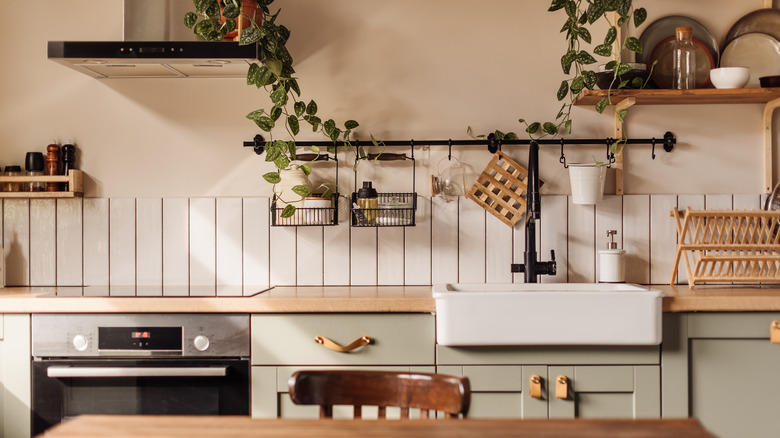
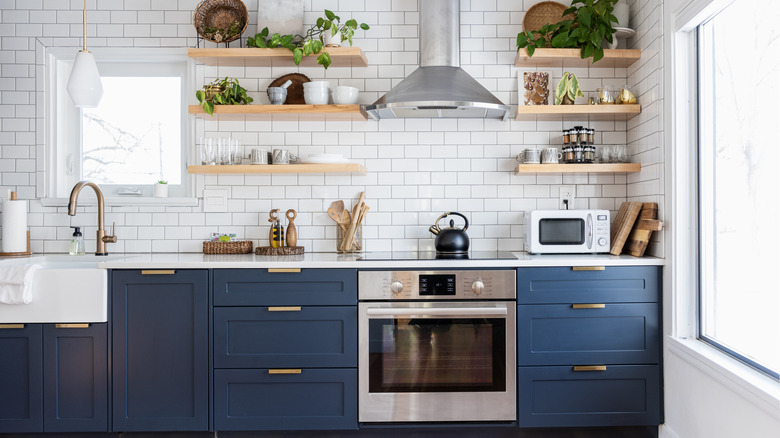
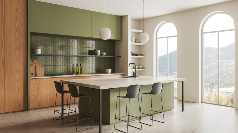
Cabinets may come next on your list, or they may come first. "For a mid-century modern kitchen, I like to begin with the cabinetry," Arvid Lithander says. "These are the architectural bones of the room." If you're going to leave the cabinets unpainted, warm wood tones are best. For painting them, Teri Simone says, "Matte shades like avocado or smoky blue can really set the mid-century tone." And if you like color but don't want to drench the room, she adds, you always have the option of painting only the lower cabinets.
You don't have to paint kitchen cabinetry if you don't want to, though. If you lack confidence or just don't want to deal with the prep, there are several paint-free ways to update your kitchen cabinets.
Don't forget about furniture and islands
There are any number of ways to decorate a kitchen island for function and aesthetics, but whatever you do, make sure the result ties into the rest of the room's color palette. This is just as important whether you're painting your kitchen island and furniture or simply decorating them with accessories.
That said, the island and any furniture in the room both present opportunities. "I like to treat it like a statement piece," Iryna Kolosvetova says. "Rich wood, retro blues, or burnt orange bring that collected vintage feel and work beautifully when coordinated with natural textures like linen or ceramics." Islands and furniture are also a great way to tie the room together. "Try contrasting your cabinets, like a painted island in a bold tone that ties in with your accent wall or bar stools in a fun, vibrant vinyl or leatherette," Teri Simone says.
Look up

Many people who are going for a mid-century modern look forget to paint kitchen ceilings, but this is a mistake. Learning how to decorate in the mid-century modern style is, remember, all about balance and harmony. Unfortunately, a neglected ceiling can throw all of that off, even if you never look right at it.
"Ceilings in mid-century homes weren't always plain white," Hayley McAteer says. "A soft tint, like a warm white or pale color, can pull the whole room together. Leaving it bright white can throw off the balance." Happily, she says, while most people miss this step, it is an easy fix. Just grab some neutral paint samples you think will go with the rest of your colors and swatch them when you do the rest of your wall, cabinet, and trim swatches.
Narrow down your choices
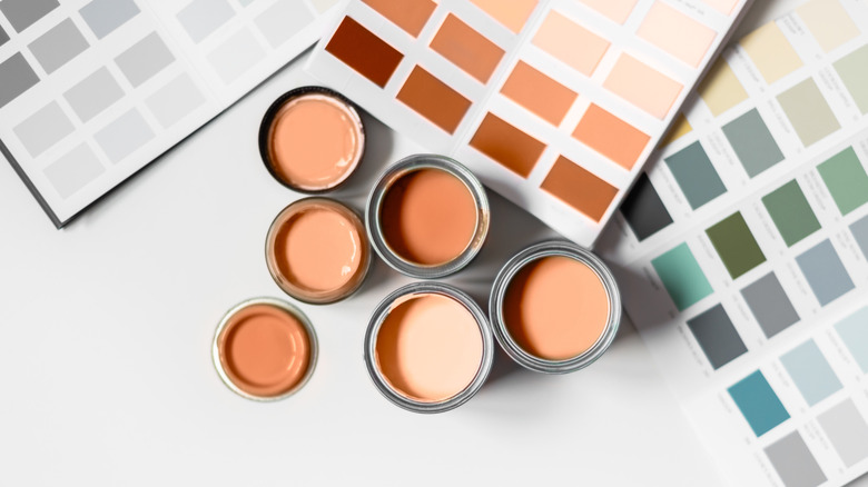
So you've gathered tons of ideas, you're covered in paint cards, and you broke your phone testing so many different colors on your app. Before you start to paint kitchen swatches for real, though, it's smart to narrow down your choices a bit. So just how many colors should you bring home and test, you're wondering?
"Narrow it down to 3–5 colors you love," Teri Simone recommends. "Then get sample pots to test on the wall." Yes, paint pots really are a must. "The large peel-and-stick samples aren't fully representative of how the color lays in real life," she says. If you don't put actual paint on the walls, you may miss elements of how that color interacts with your lighting, finishes, and shadows in real life. "A sample pot is critical in making sure you love the tone," she concludes.
Paint swatches

It's tempting to get to the fun part, but swatching is key. Don't go for broke and just paint kitchen surfaces with abandon, because you might miss one of the most critical aspects of a redesign: testing color in your own space. No matter how much test-driving of color you've done, only swatching can give you reliable results. "Screens lie; paint does not," Rachel Blindauer says.
Why? "Color shifts a lot under different light," Hayley McAteer says. "What looks fine at noon can feel off by dinner. Try at least three colors on different walls. Leave them up for a few days. It's the only way to know how it really works in your space." More specifically, Rachel Blindauer says, paint two coats of an 18x18-inch surface on multiple walls so you can see how the color, sheen, and depth look in real life and throughout the day.
Don't know how to swatch? Luckily, that part is pretty idiot-proof. (Not that any of our readers are idiots. Some of our writers, on the other hand, may or may not have knelt in full paint trays ... more than once. So, grain of salt.) If you don't have the goods at home already, buy a Pro Grade Brush & Roller Kit. It has everything you need for painting an entire room, from rollers and brushes of different sizes to the tray itself. And don't forget to grab some painter's tape before you start the real job. ScotchBlue Original Multi-Surface Painter's Tape is a classic for a reason.
Examine your colors in all lights
Remember, Rachel Blindauer says, "Choosing color is not about following rules — it's about reading the room. Literally. Great design doesn't start with a shade card. It starts with observation." The last step before you begin to paint kitchen walls and other surfaces is to examine your swatches closely. "Color shifts dramatically depending on time of day and the direction your kitchen faces," Arvid Lithander explains. "A warm taupe in the morning can look muddy at dusk. I recommend leaving swatches up for at least three days, observing them in natural daylight, artificial light, and low light before making a final decision."
This last point is critical. It's not enough simply to pop in around lunchtime and see how things look; you need to know what those paint options look like in different weather and at different angles of the sun. Each time you make an observation, ask yourself, "How does this make me feel?" Because at the end of the day, the right color is the one that makes you feel happy and content in your cooking space. "Color is the last decision," she says, "but it's the first thing people feel." The question is not how to pick the right color, but how to pause and ensure the color is right.
Lastly, accurate swatching involves pairing possible paint colors with every other surface in the room. "And try them next to your appliances and cabinets so you can see how they interact," Teri Simone says. That might sound annoying, but "It's totally worth the effort to avoid expensive repainting regrets."