18 White Kitchen Designs That Will Make Your Space Look Bigger

White kitchens never really go out of style — and there is a reason for that. They feel clean. They feel bright. And more often than not, they feel bigger than they really are. That is not just in your head, either. Done right, a white kitchen can bounce light around, stretch your ceilings higher (visually, at least), and make the whole place seem more open. Handy, especially if your "open-concept" is more of a "squeeze-past-each-other-to-get-to-the-fridge" kind of setup.
But here is the thing: Just painting everything white does not automatically give you a light, spacious dream kitchen. In fact, go overboard and it can start to feel cold, clinical, and kind of like you're living inside a fridge. The trick is knowing where to use white — and how. Think finishes, surfaces, cabinetry choices, even grout color. It is all about layering the right tones and textures so it still feels lived-in, not sterile. We have rounded up some smart, space-stretching white kitchen tricks that work for real homes — no reno required. Let's get into it.
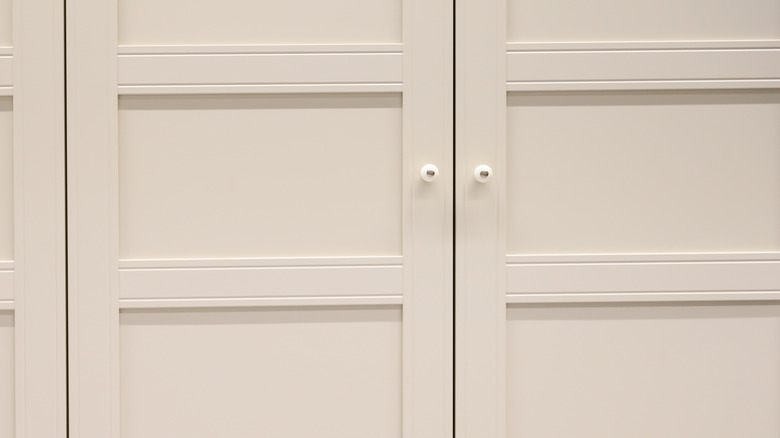
1. Use all-white upper cabinets to create vertical flow
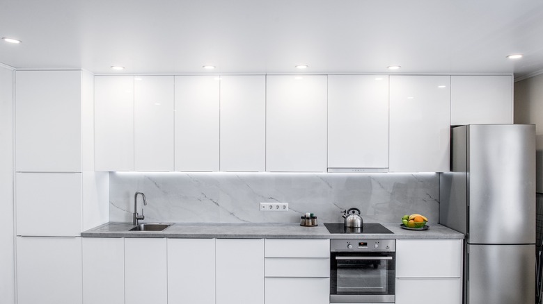
When your upper cabinets are the same white as your walls, they don't draw a line across the room. The color continues all the way to the ceiling, and the usual break between surfaces disappears. Without that interruption, the whole space feels more open — not in a dramatic way, just a bit less closed-in.
Darker or wood cabinets are more noticeable. They create weight and define boundaries, which works in some spaces, but can make smaller kitchens feel tighter. White cabinets, especially when they match the wall behind them, do the opposite. They hold the same shape but visually sit further back.
It only really works if the whites match. A bright cabinet against an off-white wall still creates a contrast line, and that line is what breaks the effect. One clean shade — same tone, same finish — keeps everything feeling like part of the same surface.
2. Choose white quartz countertops with minimal veining
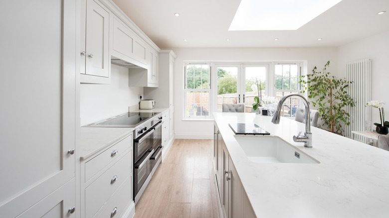
White quartz sits quietly in a kitchen. The color stays light, the surface reflects a bit of brightness, and there's nothing drawing focus. That is useful in smaller spaces where too many details can make the room feel crowded.
Counters with heavy veining or bold patterns tend to break the surface up. Even if the layout stays the same, those shifts in tone create contrast where it's not needed. When the veining is minimal, the eye just moves across without interruption.
A polished finish reflects more than matte, which adds to the overall light in the room. It is not about making the countertop stand out — just letting it sit cleanly with the rest of the space.
3. White appliances make for a seamless look
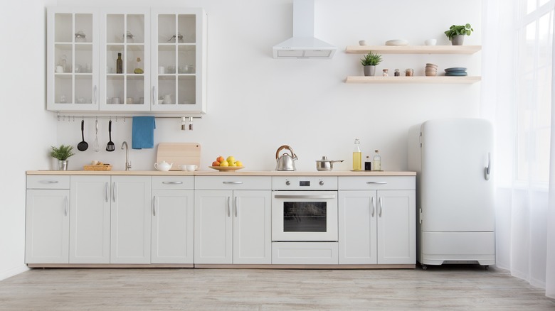
White appliances used to feel a bit dated, but they have shifted. Newer models often have flat fronts, simple handles, and fewer details that stand out. That makes them easier to pair with white cabinetry without breaking the look of the room.
When appliances match the cabinets around them, they do not separate themselves from the layout. There is no sharp contrast or change in material that divides the space. In a smaller kitchen, that difference can matter — not because the appliances disappear, but because they don't call attention to themselves.
Stainless steel and black finishes tend to mark their shape more clearly. They can still look clean, but the edges show. White blends back in, especially when the tone stays consistent across surfaces.
4. Opt for white painted brick or shiplap walls
White kitchens can start to feel flat when everything is smooth. Adding texture through painted brick or shiplap gives the walls something to say without changing the color palette. The surface still reflects light, but it does not feel blank.
White brick adds soft variation. The texture is not loud, but it breaks up the wall just enough. You still get the brightness, but with a surface that has some depth. Shiplap does the same, just with direction — the horizontal lines give the wall a bit of movement without drawing focus.
Because the color stays the same, the room keeps its overall feel. Nothing heavy, nothing sharp — just a bit of detail that sits quietly in the background and keeps the kitchen from feeling too sterile.
5. Install white subway tiles in a vertical pattern

Turning subway tiles vertical instead of sideways changes how the wall feels. It makes the space seem taller, even if the ceiling hasn't moved. The eye just kind of follows the lines upward. You still get the familiarity of a classic material, but with a different flow. The tile moves with the wall instead of sitting across it, which helps draw attention to the full height of the space. It is subtle, but in a kitchen that already feels a little tight, that shift matters.
It works best with white tiles and grout that doesn't stand out. When the color's the same, it all flows. Dark grout breaks it up and pulls focus, which can make the wall feel busier than it is.
In a smaller kitchen or a narrow one, this layout does more than expected. It is not a big change, but it shifts the feel of the room. Doesn't draw attention to itself — just quietly makes everything feel a little more open.
6. Select white glass-front cabinet doors

Glass cabinet doors change the whole vibe of the space. Instead of the eye stopping at a solid door, it keeps going — all the way to the back of the cabinet. That bit of extra depth, even though it is small, makes a difference in how open the kitchen looks.
It is not the same as open shelving, but it gives a similar feeling. You still get the structure of a closed cabinet, just without the hard stop. In smaller kitchens, even that small change in visibility can make the wall feel a little softer.
White frames help, too. They keep things looking clean and don't interrupt the rest of the wall or the cabinet layout. It all blends in, so nothing feels broken up. The see-through part only works if what's behind the glass looks decent, though. Too much clutter and the effect disappears. Keeping things simple — similar colors, not too crowded — makes it feel lighter and more spacious overall.
7. Paint all trim and molding in matching white
Painting the walls, trim, and moulding the same white removes the lines that usually break up a room. When everything matches, it reads as one surface. The edges don't jump out.
In a smaller kitchen, that matters. Less contrast means fewer visual stops. The space feels quieter and less boxed in. It does not need to be the same finish. Trim can be semi-gloss, walls can be eggshell. That doesn't affect how the color works. What counts is the match. One white, across everything. No outlines. No sectioning. Just a single background that doesn't pull focus.
8. A white farmhouse sink makes the perfect focal point
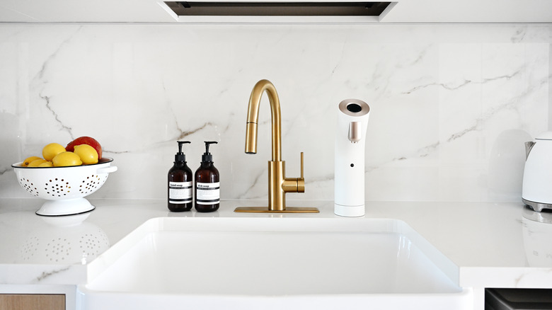
A white farmhouse sink is large, but it doesn't make the space feel smaller. Because it matches the countertop, it blends in rather than breaking things up. That continuity helps. There's no harsh edge between sink and surface. It all reads as one shape, which makes the layout feel more open. Metal or colored sinks interrupt that. They stand out and pull focus.
The size of a farmhouse sink also changes how the space around it feels. Larger sink, wider-looking counters. And because the basin is deep, it handles big pots or trays without needing more counter space. It works visually, but it is also just practical — especially in a smaller kitchen.
9. White pendant lights with clear or white shades are a great lighting selection
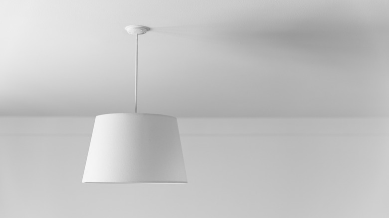
White pendant lights are a good option if you're trying to keep a kitchen feeling open. They do not pull focus the way darker fixtures do. When they match the ceiling, they stay out of the way. The shape matters too. Something simple with a light shade — white or clear — gives you the brightness without adding bulk. That extra bit of light helps more than you think, especially in smaller kitchens where shadows gather quickly in corners.
These fixtures work well over islands or sinks. They give task lighting where it's needed, but don't block the view across the room. That keeps the space feeling connected. Some pendant designs go heavy on detail or color, which can look great in a bigger room. But in a tighter layout, the cleaner versions do more. You notice the light, not the light fitting. And that's the point.
10. Install white ceiling beams for added height illusion
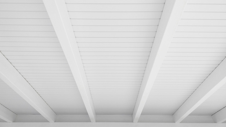
White ceiling beams can add detail without making the room feel lower. Unlike dark wood, they do not carry as much weight visually. They sit quietly in the background, but still bring shape and structure to the ceiling.
The lines help, too. They guide the eye across the space and upward, which can make the ceiling feel a little higher than it is. That is useful in rooms with standard ceiling height.
Keeping them white is what makes it work. You get the character of exposed beams without breaking up the space. It still feels bright, open, and clean. The texture adds something, but it does not compete. The focus stays on the room as a whole, not the ceiling.
11. Pick white floating shelves instead of upper cabinets
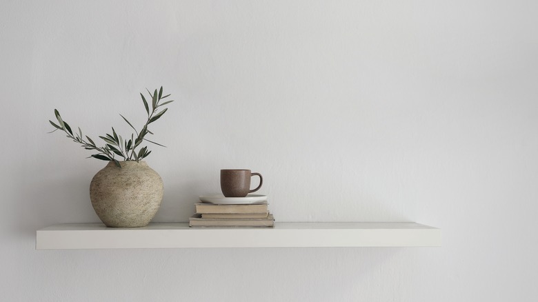
Some kitchens use white floating shelves instead of upper cabinets. It keeps the walls open and makes the space feel less closed in. The shelves keep the layout clean. When they match the wall color, they do not stand out. Everything stays light, and nothing breaks the line of sight. You see more of the wall, and that openness makes the whole room feel a bit wider.
It also helps with light. Cabinets can block it or cast shadows, especially near corners or under bulkheads. Shelves let it move through the space. That's a quiet change, but it shifts how the room feels. Keeping things on the shelves simple matters too. Strong colors or too much clutter will pull focus fast. A few calm pieces — a bowl, a jar, maybe one or two everyday things — is usually enough. The shelves stay useful, but the wall stays calm.
12. Use white marble with dramatic veining sparingly

White marble with bold veining can stand out without taking over the space. Used on one surface — like a backsplash or island — it becomes a focal point without adding too much pattern. The white background keeps the room feeling bright. The veining adds detail, but the overall look stays clean. This works well in smaller kitchens. Too many strong materials at once can make the space feel busy. One statement surface, surrounded by simpler ones, avoids that.
The marble brings texture and contrast, but the light color keeps the space open. Everything else can stay minimal, so the focus stays on that one area without making the room feel full.
13. A white window trim frames natural light
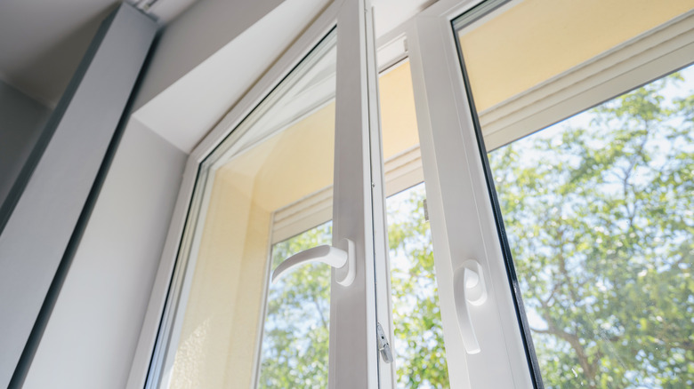
White window trim keeps the edges clear and lets the light stand out. The frame does not compete with the wall: It just gives the window a clean outline. In smaller kitchens, this can be useful. It keeps the focus on the window without adding contrast that might break up the space. If the walls are white, too, the trim can still be brighter or use a different finish. That keeps the surfaces from blending completely, but still feels simple.
White reflects more light than most colors. Around a window, that adds to the overall brightness in the room. The trim doesn't need to stand out — it just supports what's already there.
14. Install white penny tile flooring
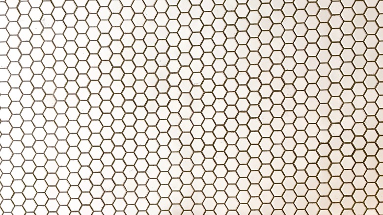
White penny tiles cover the floor with a soft, even pattern. The small shape keeps the scale low, and the round edges make the surface feel lighter.
There are more grout lines than usual, but they stay consistent. Nothing jumps out. The floor sits quietly in the room without pulling attention. A glossy finish reflects some of the light coming in, which can help brighten the lower half of the space. The white tile and white grout blend together and keep the surface looking smooth. In a smaller kitchen, this kind of flooring keeps things simple. The pattern stays close to the ground. Everything else is free to stay open.
15. Add white bar stools with slim profiles
White bar stools with a simple design can help the kitchen feel more open. Slim legs and open frames don't interrupt the space, and when the stools match the cabinetry, they blend in without creating contrast. Everything stays light and consistent across the room.
More ornate shapes or thicker frames can take up the same footprint but feel heavier by comparison. Choosing a plain, minimal shape avoids that. Many modern designs also stay comfortable without needing bulky materials. The structure stays clean, the floor remains visible, and the layout feels less crowded overall.
16. Pair white hardware in sleek, minimal styles
Some kitchens use white hardware on white cabinets so the handles blend in. Without the contrast, the doors look more like part of the wall than separate pieces, which keeps the surface feeling calm.
That is especially helpful in smaller spaces where too many details can stand out. When the hardware doesn't pull focus, there is more room for everything else to sit quietly in the background. The shape doesn't need to be anything complicated. A basic pull or knob in a flat finish usually works best. Glossy ones can reflect the light and start to draw attention again, even if the color matches.
17. White crown molding creates ceiling height illusion
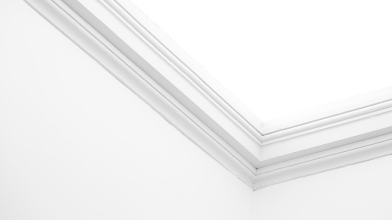
Some kitchens use crown molding at the top of the wall, painted the same white as the ceiling. When there is no color change, the edge softens. The transition feels less defined. That blurring of lines makes the ceiling feel like it sits a little higher.
It is not a huge shift, but in smaller kitchens, it adds just enough lift to matter. The surface does not stop so abruptly, and the extra detail around the edge gives the space a more finished feel without crowding it. In rooms with standard-height ceilings, narrower molding usually works best. Two to 5 inches is enough to do the job without drawing attention to itself.
The shape makes a difference, too. A simple profile blends into the wall. The more intricate ones catch the eye and can pull focus — which is fine if that's the goal. But if you're trying to make the space feel bigger, quiet wins.
18. Try a glossy white ceiling to reflect light

Most ceilings go matte and stay out of the way. That's fine. But switching to something with a bit of sheen (even just a satin finish) changes how the room feels. The light bounces back into the space instead of getting swallowed up. You do not notice it immediately, but everything feels a touch brighter. A bit taller. The ceiling doesn't press down as much.
In small kitchens, that is useful. You're already working with limited space, so any surface that reflects instead of absorbing helps open things up. It still looks white. It still blends in. But it gives back some of the light that usually disappears up top. It's not common, which is probably why it works. People don't think to use it. But if you're already going white everywhere else, it makes sense to let the ceiling do a little work too.