How To Paint Kitchen Cabinets To Make The Room Look Bigger
If you have a small kitchen, you've likely considered ways to free up space and make it feel less cramped. Maybe you've already made use of storage cubbies to maximize kitchen space, or peg rails with mini storage baskets attached — a chic hack to free up tons of counter space. Clearing clutter and organizing storage is a great start, but you can also make your kitchen feel a bit more spacious just by choosing the right color for your cabinets.
The average small kitchen has eight to 12 cabinets, though that number can vary drastically depending on the layout. Those cabinets, and drawer faces as well, present big blocks of color in the space and have an influence on the overall feel of the room. For tips on how to use the color of kitchen cabinets to our advantage, we spoke with Whitney Vredenburgh, owner of Nested Spaces, which provides home staging and design services in Indianapolis. Vredenburgh had two suggestions on how to make a room feel bigger with the color of your cabinets: Remove the distracting colors from your cabinets and paint or stain them with neutral colors.
Stand-out colors, busy wallpaper, and extravagant countertops can all close off a room, making it feel smaller and busier. The opposite effect is true for neutral tones and color palettes like those with cool blues and warming yellow undertones. Vredenburgh explained: "Neutral cabinet colors (that are) warm neutrals or cool neutrals, white cabinets, and even stained cabinets — light or dark — can make a space look and feel bigger."
How to use neutral cabinets in kitchen design to make the space seem bigger
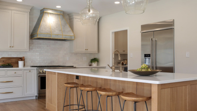
Neutral tones set a calm and open vibe in a room, blending into the background as you get used to the space. Tones of gray provide a modern touch, and beige gives you a cozy, earthy vibe. Gentle greens make the room feel a little closer to nature. Choose your neutral colors for cabinets with the rest of the kitchen in mind, and you'll enjoy a space that feels intentional and a little more open. "For example," Whitney Vredenburgh said, "The kitchen featured has painted cabinets that are Sherwin-Williams' Accessible Beige perimeter cabinets and a dark-stained island. The countertop is a Mykonos leathered quartzite — soft, subtle veining that does not draw attention to itself."
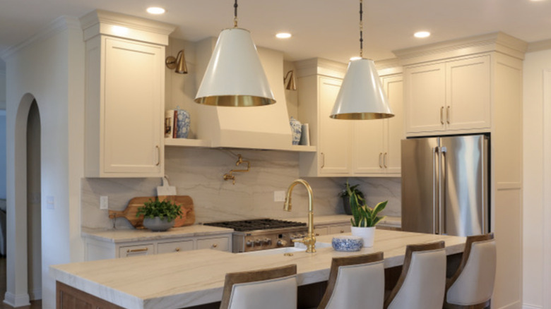
Vredenburgh has also used tones of gray — specifically Sherwin-Williams' Worldly Gray — for the kitchen's upper and lower cabinets. The gray cabinets were paired with a light-colored oak island that had a taupe-veined quartz countertop. You could even add a few more touches of personality to the space with updated hardware — an overlooked cabinet fix to boost your kitchen's style. Design choices like this show how you can still use interesting pieces that give off neutral vibes and make the kitchen feel bigger at the same time.