

How The US Food Pyramid Has Changed Since The '90s

If you went to school in the United States anytime between 1992 and the early 2010s, chances are pretty high you saw the food pyramid splashed on classroom posters or cafeteria walls. The original idea actually came from 1970s Sweden as a way to show how people could eat affordably among rising food costs while also meeting nutritional needs. The Swedish design was as much about price as it was about nutrition: It used the wide pyramid base for cheap staples, including dairy, potatoes, pasta, and cereals; more expensive essentials, such as most other fruits and vegetables, were in the center; and expensive proteins, such as meat and fish, went on top. It mostly ignored unhealthy treats, such as candy, which have appeared on the top level of other food pyramids.
The Swedish version caught on in other countries, and the U.S. debuted its own version in 1992. That 1992 food pyramid hasn't stayed the same for 30-odd years, though. Scientific understandings of nutrition change over time, leading to revisions to the food pyramid. Some critics have even noted that the food industry has had influence in how the pyramid has been structured. It could also be argued that politics have had some impact on the most recent pyramid launched in early 2026. With all that in mind, here's a trip down the food pyramid memory lane.
Before the pyramid: basic sevens and fours
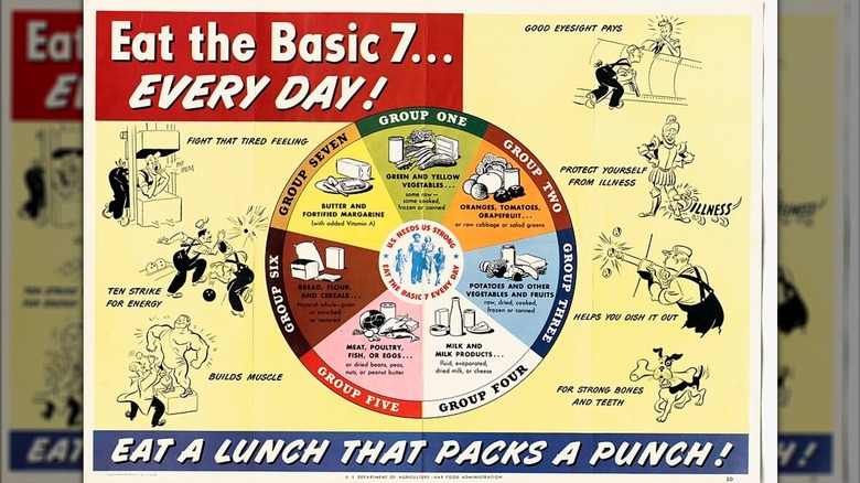
The 1990s was not the first time the U.S. government got into the business of nutritional advice. Back in 1943, wartime rationing led the government to start publicizing the concept of the "Basic Seven," a wheel that split food up into seven groups. The idea was that you'd eat something from each category at least once daily. Some categories are still familiar to us today: bread and cereals make up one of the seven groups, dairy is another category, and proteins such as meat and eggs were also grouped together. However, fresh produce was split up three ways, with oranges, tomatoes, and grapefruit somewhat confusingly all categorized together.
In the 1950s, researchers simplified this down to the "Basic Four," with categories for fruits/vegetables, dairy, meat, and bread/cereals. This framework stuck around until the advent of the food pyramid. In the 1970s, the government also released a series of dietary goals to help publicize links between Americans' diets and various illnesses. This added more nuance to the existing dietary recommendations, with advice that Americans should consume sugar and salt in moderation.
1992 to 2005: the original pyramid
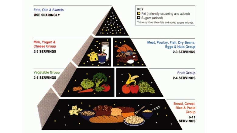
The "classic" pyramid, if you will, was split into six sections across four layers, with the middle two layers being split into two sections each. The bigger the section, the more of it you should eat. This pyramid put grains (including bread, pasta, and rice) at the base with six to 11 servings, followed by fruits and vegetables, which shared the next layer up with two to five servings. Dairy and protein (which grouped together meat, fish, eggs, beans, and nuts) shared the next layer up with two to three servings, and the tip of the pyramid was for fats, oils, and sweets "used sparingly."
Some of the food pyramid's advice may seem outdated by the 2020s, but they did reflect popular understandings of nutrition at the time. Excess fats (even healthy fats) were somewhat frowned upon, and due to ultra-high-protein diets causing health problems in the 1970s, the pyramid suggested somewhat restrained intakes of it. Nowadays, we consider its carbohydrate recommendations excessive.
There was also political wrangling behind these design choices. The original design placed produce at the base, but lobbying from the grain industry resulted in a switch. The design wasn't so nuanced, either: It didn't differentiate between types of fats or whole grains versus refined ones. In spite of these issues, it stuck around for 13 years.
2005 to 2011: the confusing, fragmented pyramid
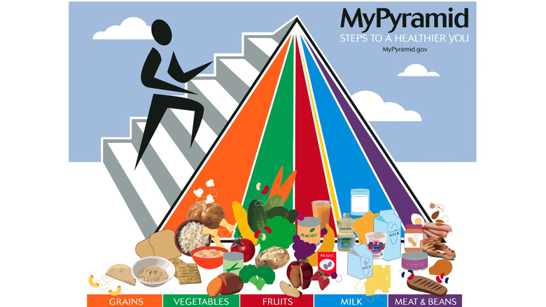
The second U.S. food pyramid aimed to fix some of the original's flaws, although it arguably just made nutrition more confusing. This pyramid was flipped sideways so no group would occupy the all-important base of the pyramid alone. It was then sliced into triangular pieces that stretched up to the top of the pyramid, with the different sizes of the triangles meant to indicate which foods were more important. Also, there was a stick figure running up the side of it to emphasize physical activity.
Called MyPyramid, the verdict was that this redesign was just confusing, and that extracting meaningful information from it was difficult. One change was that the government brought in more precise guidelines about how much of every food group you should eat every day. Plus, the recommended grain intake was lowered. However, this kind of information wasn't listed on the pyramid. You were meant to go to the MyPyramid website to get more detailed information. While that website appears to have provided useful information tailored to different people and body types, the pyramid was just too confusing, and was dropped after six years.
2011 to 2026: from pyramid to plate
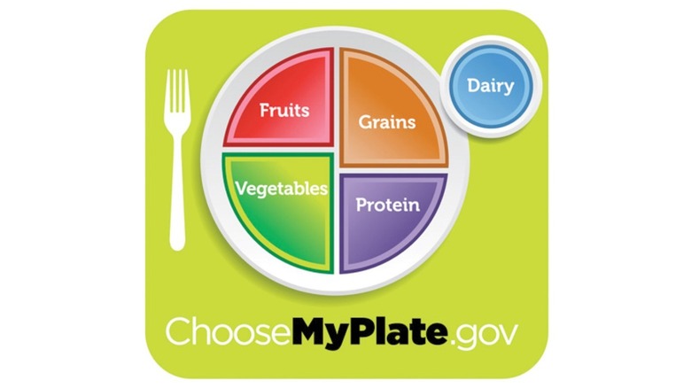
The Obama-era food pyramid wasn't even a pyramid, but a plate. Michelle Obama and Agriculture Secretary Tom Vilsack played key roles in creating MyPlate, with the main idea being to convey the information in a simpler way than MyPyramid. The plate was divided into four sections, with one each for vegetables, grains, protein, and fruit; dairy was demoted to a small circle (a glass, apparently) next to the plate, implying you should keep dairy intake limited.
Some of the problems from the original food pyramid resurfaced with MyPlate. It was criticized for not going into much detail about the types of grains, proteins, or fats that were better or worse to consume, just as the original didn't differentiate between refined grains and whole grains. It was also criticized for not giving any advice on unhealthy foods. Reportedly, only about a quarter of Americans were actually aware of MyPlate — and far fewer tried to put its advice into practice. Yet, for all its flaws, MyPlate stuck around for about 15 years, longer than any other food "pyramid."
2026 onwards: the reversed pyramid
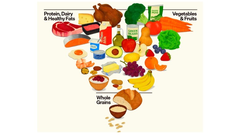
Trump-appointed Health and Human Services Secretary Robert F. Kennedy Jr. revived the pyramid shape in early 2026 with one big change: The pyramid is flipped upside down. As with the 1992 original, the widest part of the pyramid represents what you should eat most. However, instead of grains occupying this part, it's a bunch of categories: fruits, vegetables, protein, dairy, and healthy fats. Unlike the four layers of the 1992 version, there only seems to be one other layer here: grains, which are relegated to the narrower section of the pyramid. This implies you should eat less of them, yet, confusingly, the text that goes with the pyramid still suggests two to four daily servings.
The pyramid has drawn mixed reviews from nutritionists. It received a thumbs up for its call for people to avoid ultra processed foods, a food category that previous pyramids didn't really touch upon directly. However, protein recommendations were nearly doubled, and fats in the form of full-fat dairy, olive oil, and beef tallow (which had fallen off in popularity) appear to be encouraged, going against many nutritional guidelines. This led the American Heart Association to suggest that this might be encouraging excessive consumption of saturated fat and sodium. In any case, the pyramid will likely be around until at least 2030 since the dietary guidelines that came with it are set to run until then.
Food pyramid controversies: lobby groups, bad designs, and politics

The pyramids' designs have led to various controversies. We mentioned how the grain lobby pushed for changes to the 1992 version, but they weren't the only ones who fought it. Meat and dairy lobby groups managed to get the original pyramid design withdrawn, winning a redesign that shied away from language encouraging people to "eat less" of these products. The next two versions were then criticized for a lack of clarity. The 2005 pyramid was just confusing. While the MyPlate graphic that replaced it was considered easier to understand, it completely avoided giving advice on unhealthy foods, such as sugary treats, giving an incomplete picture.
However, it's the 2026 inverted pyramid that has been the most controversial. By encouraging people to go back to full-fat dairy, it goes against currently accepted views on saturated fat (which full-fat dairy has more of). Meanwhile, the design was criticized for placing grains at the pointy, "eat less" end of the pyramid, even though official advice is still to consume up to four servings of them per day. While it was praised for explicitly advising against eating excess sugar, the overall redesign has been criticized for simply embodying Robert F. Kennedy Jr.'s controversial — and not always scientifically valid — "Make America Healthy Again" movement.