Why Domino's Pizza Changed Its Classic Colors
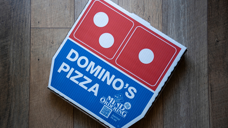
Domino's, the largest pizza company in the world with a six-decade history, has gone and changed its classic colors as part of a rebrand, the first in 13 years. Since 1969, when it introduced its second logo, Domino's has used a red, white, and blue color scheme for its branding. While those colors remain, the red and blue are now much more vibrant. A Domino's press release describes them as "hotter, more delicious colors." The reason has everything to do with a changing world that spends more and more time on social media.
The company says the new brighter hues are meant to evoke the heat of a freshly baked pizza. But, it has admitted the rebrand, including the bolder colors, are really about capturing the shortened attention spans of younger consumers as they scroll through TikTok, Instagram, and other sites. The chain is using the new, brighter colors on everything from employee uniforms to its pizza boxes, along with some other changes. But, in today's heated environment, company rebrands can quickly go wrong — as was the case when Cracker Barrel tried to jettison its mascot Uncle Herschel from its logo, causing an uproar that had the company backtracking on the changes.
This isn't Domino's first color tweak
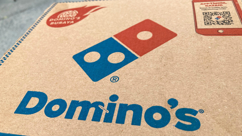
Unlike other fast food giants that have made some bold changes to their logos and other branding over the years, including Chick-fil-A changing its spelling from Chick-Fill-A, Domino's has continued to keep the same basic color scheme and logo featuring a domino. But that doesn't mean the company hasn't altered things over its 65 year history. Its logo went through four changes from 1965 to 2012, making this the fifth logo change in the chain's history.
It first tweaked its color scheme in 1975, when the chain began using more saturated colors in its branding. There have also been some other related changes, including when Domino's ditched its pizza-hating mascot, the Noid, in 1995 after nine years — just one of the fast food mascots you've probably forgotten. The biggest may have been when it officially dropped "Pizza" from its name in 2012, rebranding simply as "Domino's" since it had expanded its menu. Even if Domino's new, bolder red-and-blue hues don't capture its target audience's attention, the pizza company's other color change may: It's introducing black boxes with metallic gold for its handmade pan and Parmesan-stuffed crust pizzas, boldly straying from the brand's original color scheme.