Our Definitive Ranking Of Every Le Creuset Color
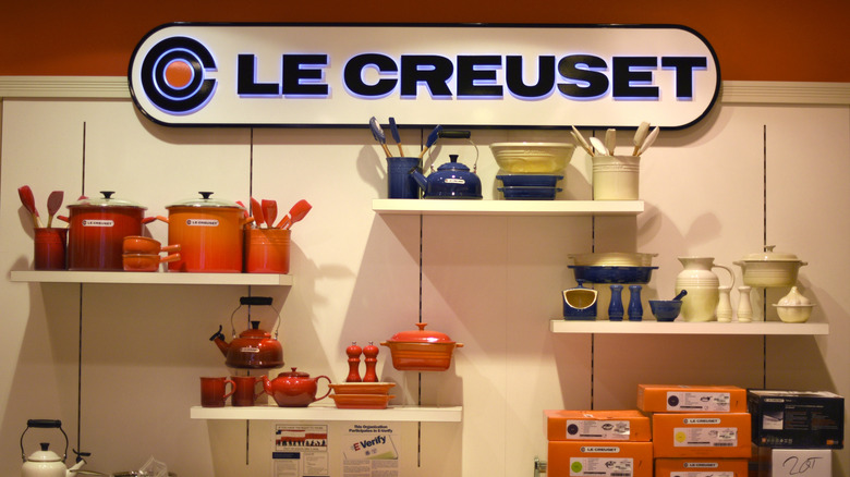
For more than 100 years, Le Creuset has been splashing our kitchens with color. The French cookware brand, known for its enameled (often cast iron) cookware and kitchen supplies, has built a cult following of devotees thanks to its high quality, heirloom-worthy products, such as its fantastic cooking pans and Dutch ovens, which can be thrifty vintage kitchen tool finds. Plus, the brand has a wide array of signature colors. For many fans of the brand, choosing the color is not just a matter of fleeting fancy but a core aspect of their personality.
Even so, Le Creuset is known to switch up its color lineup with some regularity, and many shades and designs have gone the way of the dodo in the past century, becoming retro designs that are worth a pretty penny today. Currently, there are 24 shades in rotation (including two now defunct shades still stocked on the Le Creuset site). With such variety, it can be difficult to parse the good from the bad and the fantastic from the better-off-retired. So, to help guide you through the colorful world of Le Creuset, we've ranked every shade, and you might be surprised which color came out on top.
24. Brioche
We have nothing against shades of beige and cream. A good neutral can add a sense of sophistication and serenity to any space. However, there is a difference between beige and boring. Unfortunately, brioche does not clear this hurdle. It is monotone and forgettable. You're better off going with another shade.
23. Pêche
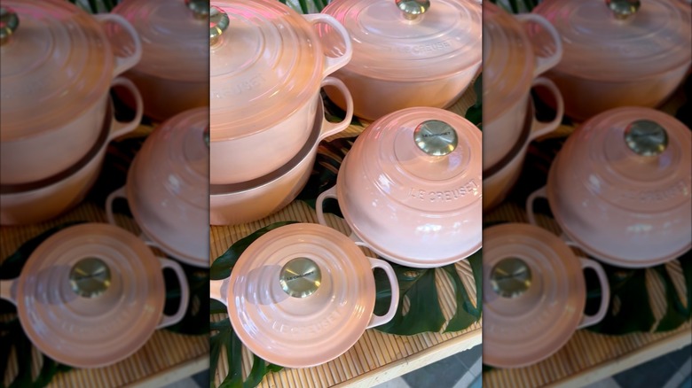
The problem with pêche is not necessarily the color itself — an ombre of light, warm peach and pink — it's that it simply doesn't work for Le Creuset's line of cookware. Simply put: The color is too fleshy in appearance. And who wants a collection of skin colored cookware? The very concept seems odd for such a bright shade. This color might work better for a mug, bowl, or pitcher, but even then, it just looks rather odd.
22. Mauve pink
Do you prefer gray or pink? With mauve pink, you don't have to choose. And therein lies its key flaw. Though the idea of a mauve Le Creuset is appealing, this shade fails to meet its own promise, instead delivering an abysmally gray, purplish pink that looks downright dismal in appearance. This dusty purplish, pinkish color also has the disadvantage of being neither dynamic nor distinctive, making it nearly impossible to incorporate into a cohesive kitchen design.
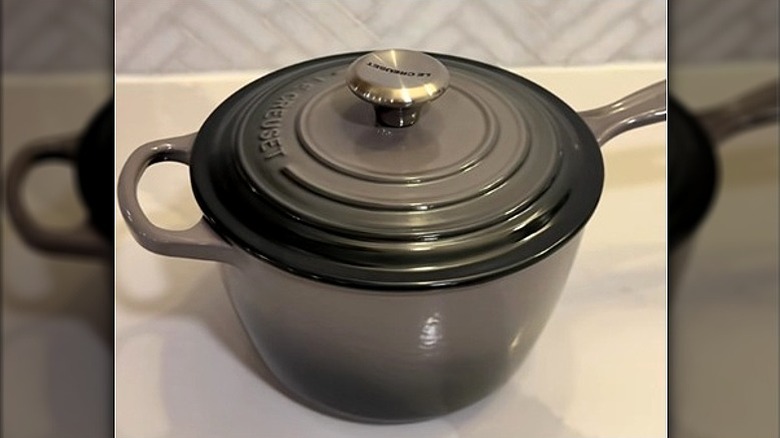
21. Licorice
First introduced in 2015, licorice is a matte black that is meant — according to the brand — to project a "classic, elegant" look. And we get it, black is supposed to go with everything. Unfortunately, this licorice color is true to its name: clunky, dark, and unappealing. Licorice neuters all of the signature Le Creuset charm, making each item look, unfortunately, generic and banal. We much prefer the shiny black onyx that was, sadly, discontinued.
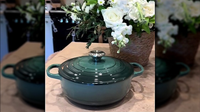
20. Forêt
First introduced in February 2026, forêt is the latest color addition to the Le Creuset lineup. As the name might imply, this hue is a deep, forest green. This color is accentuated with gold finishes that contrast with the matte look of the exterior. Despite its novelty, this color combination is anything but fresh. The combination of forest green and gold feels distinctly 1990s. This color is great for anyone who loves a vintage feel, but otherwise, it's undistinguished.
19. Nectar
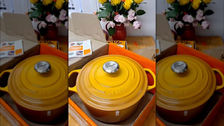
Yellow is underrepresented in the world of Le Creuset. Currently, the only yellow in the brand's catalog is nectar: a warm, orange-yellow hue. This color is vibrant, which will please some Le Creuset collectors who enjoy more vintage color schemes. The problem with nectar is it looks more mustard than sunshine and doesn't feel as sweet as the substance for which it is named.
18. Flamme dorée
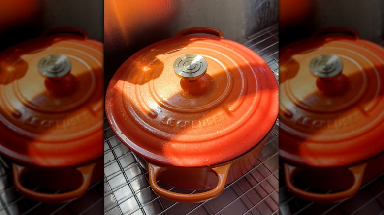
Flamme dorée was first introduced in 2025 in commemoration of the brand's 100th birthday. The color is a revamp of Le Creuset's inaugural flame color: a bright and fiery orange. And while flamme dorée is incredibly punchy — featuring an ombre of two shades of orange (which is a bit lighter than the original), sparkly finish, and gold hardware — it doesn't have the substance of the original colorway. Flamme dorée feels too much like an imitation of the original than it does as a revamp.
17. Oyster
When it comes to Le Creuset colors, oyster is hard to shuck. This gray, brown, and purplish hue is a brackish, muddy neutral that feels subdued to the point of drudgery. Ok, ok, this colorway isn't awful. The contrast between its super dark, black base and rich gray siding can be, in the right kitchen, made into a sophisticated statement piece.
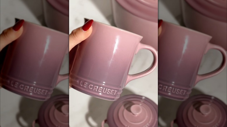
16. Chiffon pink
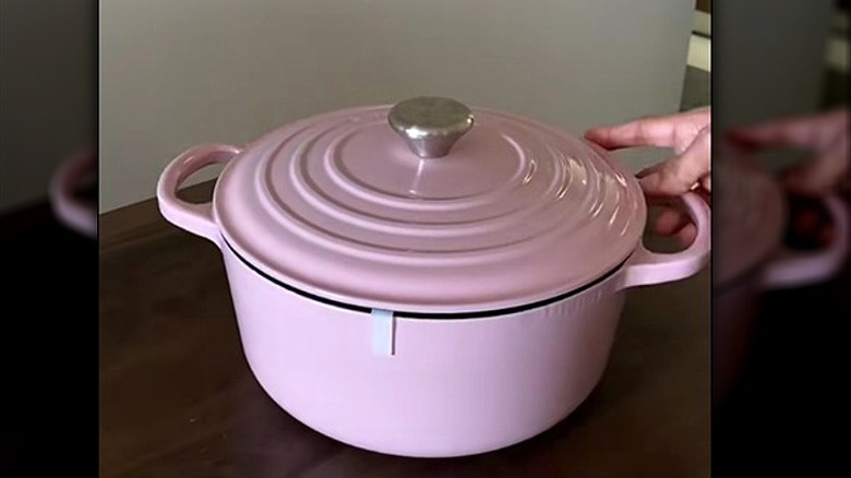
Chiffon pink is the perfect color for Le Creuset loyalists who happen to be all-in on ballerina pink. This color is light as a powder puff and as sweet as whipped cream. However, the gold hardware adds a bit of heaviness and warmth that the light, fluffy pink simply doesn't match, leaving this colorway feeling oddly imbalanced.
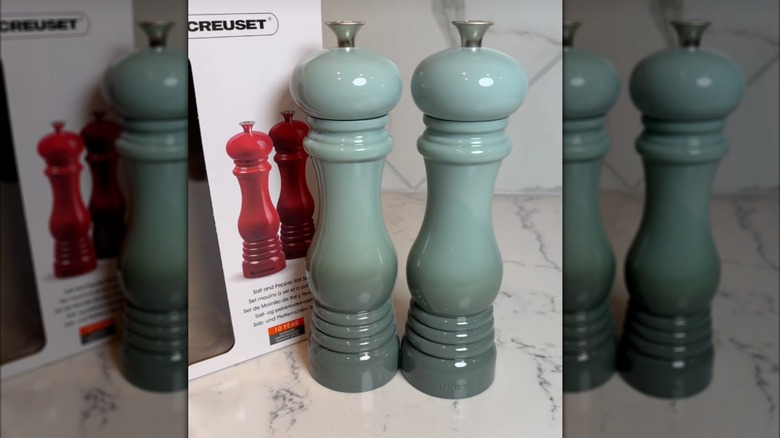
15. Thyme
Maybe now is not the thyme or maybe thyme simply isn't for now. This gray green, just left of neutral, Le Creuset color is a bit better than the gray oyster, but still feels a bit underwhelming. This color combo is somewhat charming, and the green tinge certainly makes it more dynamic than other neutrals in the Le Creuset lineup, but the gold hardware feels brash when paired with the washed-out hues of this shade.
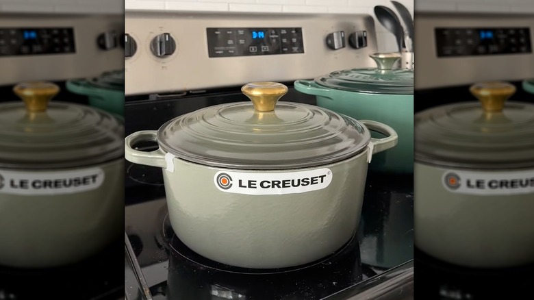
14. Olive
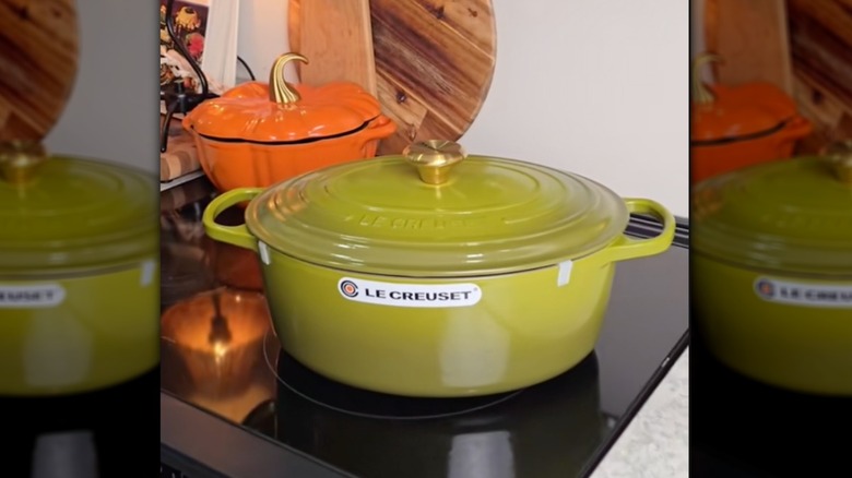
Olive is a striking entry in the Le Creuset catalog of colors. It's a rich, yellow-toned, olive green (go figure) that is heavily reminiscent of the groovy, earth toned 1970s. First introduced in 2022, this shade has the potential to be a new Le Creuset classic, if only it weren't accented with gold hardware. The metal knobs found on many items in the Le Creuset lineup clash rather than complement the shade. Or perhaps it gives this color even more vintage appeal. We can't quite decide.
13. Chambray
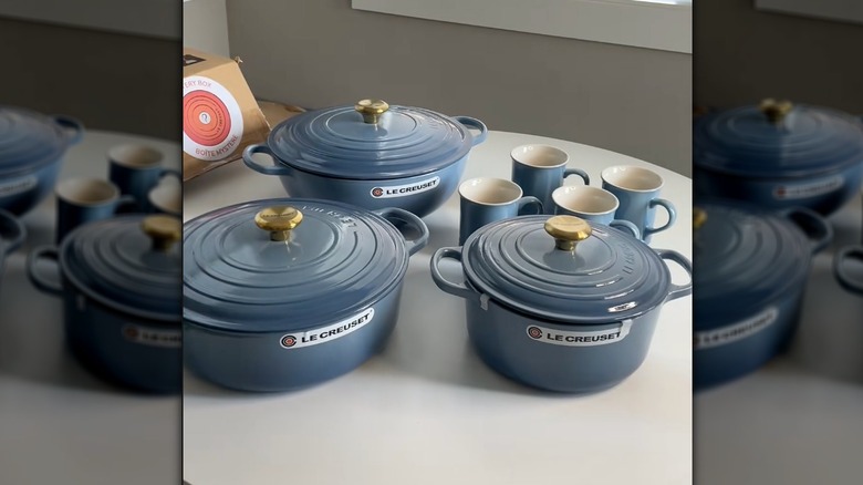
Chambray is a lovely, soft, feathery blue with just the slightest hint of gray. It is colorful without being overwhelming and would fit perfectly in the French country kitchen of our dreams. The only downside? You may have guessed it: that troublesome gold hardware. The pairing of a super saturated gold color with the soft blue limits the dynamic quality of this color scheme. However, it also gives this colorway a striking appearance that, if placed in the right kitchen, can really pop.
12. White
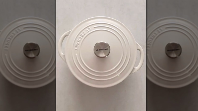
Neutrals need not be dull, and Le Creuset's white shade proves this. This entry is a single-toned, rich white that is simple and a great choice for anyone who wants to add a touch of elegance to their kitchen. Depending on the item, this color comes with either stainless-steel or gold-toned hardware, and both work with this staple color. Still, white doesn't exactly stand out against the brand's other, more colorful products.
11. Shell pink
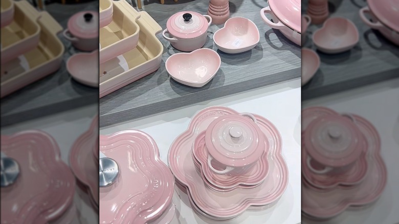
Shell pink is the Goldilocks of Le Creuset's pink selections. It is powdery, light, and bright without being overly warm (pêche) or too weighed down by gray (mauve pink). This color is perfect for anyone who wants a true pink color to brighten up their kitchen. Our one critique? It could stand to be a bit more saturated. As it is, the pink tone is quite pale. The shell pink stands alone as the strongest contender in a weak series of pinkish shades that never quite live up to the cheery hue.
10. Azure
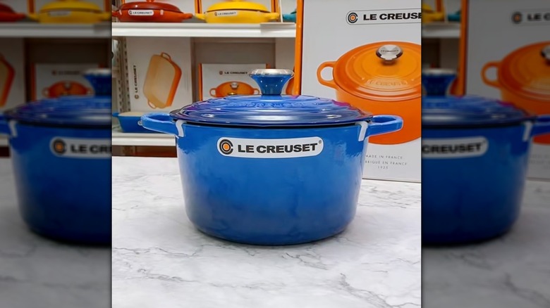
Introduced in 2021, azure feels like it could — and should — have been a part of the Le Creuset lineup for decades. This two-toned, rich blue is anything but subdued. Azure brings a pop of color to any kitchen that looks and feels effortless. This shade of blue is a great staple color, perfect for anyone hoping to collect their Le Creuset items in one, single shade.
9. Sea salt
Sea salt is a blend of green, blue, and gray reminiscent of a cloudy, briny English beachside. It is a cold dip in the ocean with a mouthful of sea salt: subdued but majestic. This color isn't just gorgeous but also dynamic. Pair with a bright azure or warm Caribbean blue for a multi-toned, but cohesive, collection.
8. Caribbean
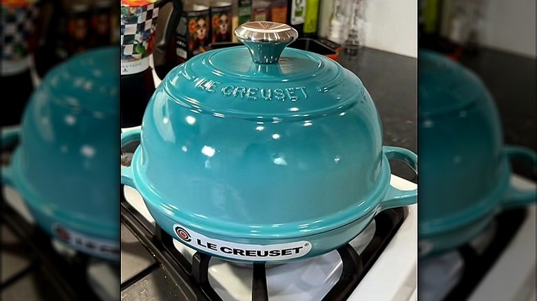
As with shallot, Caribbean has sadly been retired as of 2026. And that's a real shame because it is a warm, bright, two-toned turquoise that feels like a spring day or dip into warm, Caribbean waters. This colorway is quite popular among collectors. It is distinctive, poppy, and an instant mood booster. You can still catch Caribbean items online (and at a discount) for now, but this shade will surely become highly sought after on the secondhand market once it's sold out.
7. Shallot
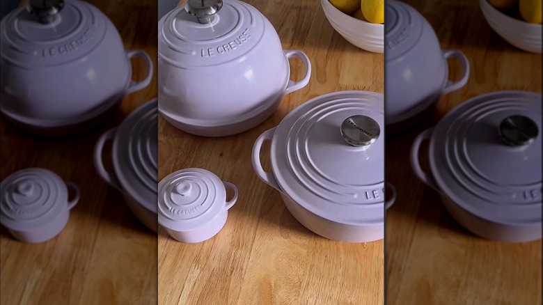
Alas, shallot was not long for this world. First introduced in 2023, this light purple hue has been retired as of 2026 (though you may be able to snag some items at a discount for a while yet). This color is stunning and subdued, a soft whisper of lavender that looks lovely in almost any kitchen. Plus, it pairs well with other pink, blue, or even neutral Le Creuset shades, so it was great for mixing and matching.
6. Nuit
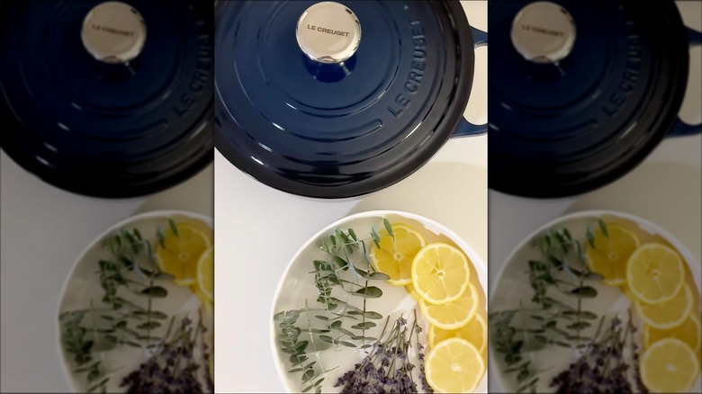
It was a dark and stormy nuit. Yes, Le Creuset's nuit is dark and stormy in the best possible way. This deep, warm, two-toned blue manages to merge intense color with effortless sophistication. This is a great colorway for anyone who wants saturated color without overt brightness. Nuit is rich, deep, and intense. It makes a great selection for anyone hoping to make a statement with their Le Creuset signature color.
5. Artichaut
Deep, creamy, and fully saturated: Artichaut is just what your kitchen needs. In a world seemingly beset by washed out neutrals and barely there beige, artichaut refuses to tone down its intense, two-toned hunter green hue. This color taps into the growing trend for dark green interiors while also remaining timeless.
4. Cerise
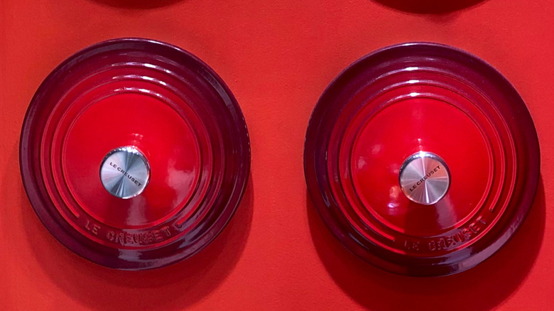
When it comes to Le Creuset, there are a few core colors that come to mind. Besides the original flame, cerise is perhaps the most iconic Le Creuset colorway, and for good reason. The bright, rich cherry red of this shade is both bold and classic, and despite (or perhaps because of) its boldness, it goes with absolutely every decor. Cerise never goes out of style.
3. Agave
First introduced in 2021, agave is a two-toned masterpiece. Blending rich green with deep blue, this colorway is both earthy and intense, and very much reflective of the succulent after which it is named. Plus, its light champagne gold hardware gives it a dash of elegance that elevates any item this shade is applied to. Agave works well especially in art deco kitchens and would look stunning behind a fluted glass cabinet or sitting on a sleek, black stove.
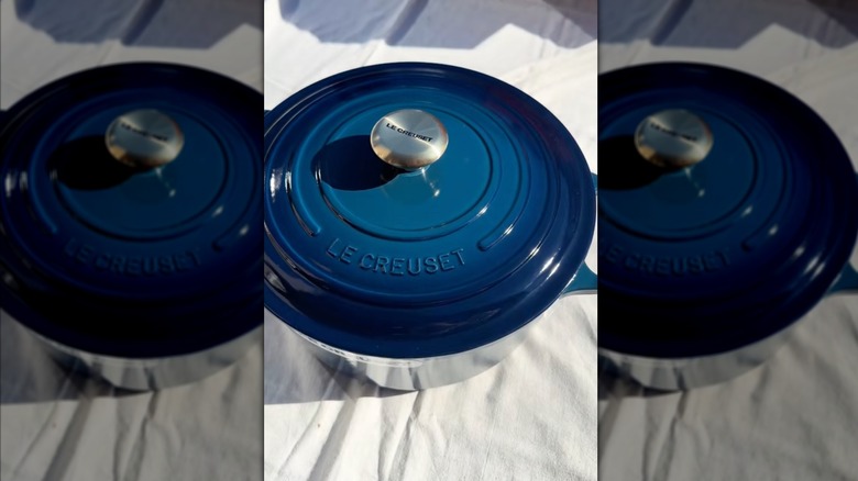
2. Marseille
Of all Le Creuset's wonderful blues, marseille is perhaps the truest and bluest. First introduced in 2012, marseille has quickly become one of the brand's staple colors. Its rich, warm blue shade is simply gorgeous and adaptable to many different decor styles. Its saturated color is playful and nostalgic without being too niche. Whether you're going for a coastal grandmother aesthetic or prefer mid-century modern, this color won't feel out of place.
1. Flame
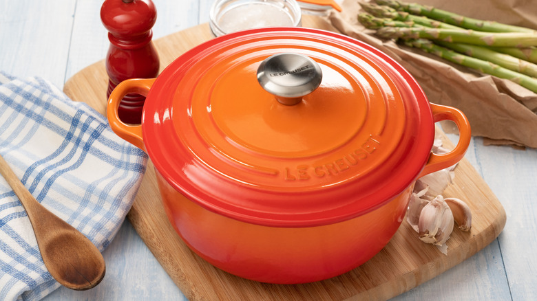
No, this bright, fiery orange isn't for everyone, but it isn't just a Le Creuset color — it is the Le Creuset color. First introduced in 1925, flame is still fresh and evocative after 100 years, while also tapping into nostalgia and mythos of the cult favorite cookware brand. Love or hate it, flame will endure. And we wouldn't want it any other way.