The Simple Reason Jack Daniel's Bottles Are Always Square
There are few brands with lore as deep and rich as Jack Daniel's. The Tennessee-based whiskey brand (technically, Jack Daniel's is also considered a bourbon) is beloved for its high quality and quintessentially American identity, opposed to the Irish style of the drink. No one would accuse the brand of being newfangled. No, Jack Daniel's sticks close to its roots, embracing tradition above all else. One such tradition is the use of square bottles for many of its products, including the mammoth 3-liter bottle.
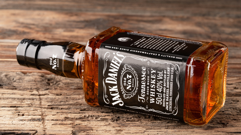
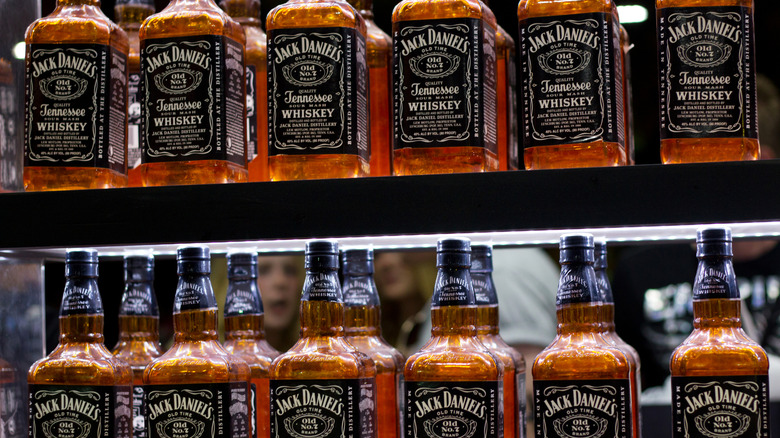
The square bottle is most often associated with the brand's Old No. 7 whiskey, though the square design is used on all of the brand's liquors, including its high-end whiskeys. This bottle shape is iconic for sure, and as closely tied to the brand's identity as interlocking Cs are to Chanel. But have you ever stopped to wonder why Jack Daniel's chose such an unorthodox bottle shape? The answer is a lot more straightforward than you think.
According to the Jack Daniel's website, the square bottle came about as a matter of Daniel's pickiness and poetic mind. Apparently, Daniel was convinced to bottle his whiskey (rather than selling it by the barrel) by his nephew, Lem Motlow. However, Daniel wasn't going to put his whiskey in any old bottle. Apparently, he went toe to toe with a glassware salesperson over bottle shapes, much to the salesperson's chagrin. Finally, he was presented with the final bottle available, a square-bottomed number. This seemed to satisfy Daniel's persnickety nature, and he supposedly noted that it was "a square bottle for a square shooter." And so, in 1895, the square-bottled whiskey hit the market.
Other theories on the bottle
One has to admit the story behind Jack Daniel's square bottles is quite fitting to the brand's slightly folksy reputation, which takes after the brand's founder, Jack Daniel. However, the story of the square-shooting square bottle might be just that: a story. There are other theories floating about the internet regarding the exact reason for the geometric bottles. One theory suggests the square shape of the packaging had a more practical purpose: to prevent broken bottles. Square bottles packed into square containers are less at risk of shattering since they can be more tightly packed.
Regardless of the story behind the shape, the use of a bottle for packaging was itself a bit of branding genius. Back in the late 1800s, when the business was still in its early stages, whiskey wasn't typically sold to customers in bottles. Instead, it was sold in barrels to bars and taverns, who would then bottle the whiskey themselves. Along with bottling, however, thrifty bartenders would often dilute the whiskey with water and other adulterants. When Jack Daniel's began selling its whiskey in bottles in 1895, this gave customers an assurance that the spirit within was pure and high-quality. Its square shape also stood out from other bottles, and has since become inextricably linked to the liquor brand, to the point that even the slightest alterations are subject to intense fan scrutiny.
Changing shape
This is not to say that Jack Daniel's iconic square bottle hasn't changed over the course of its 100-plus year history. In fact, over the past 15 years, there have been two notable redesigns to the packaging used for its Old No. 7 whiskey. In 2011, the brand released a new bottle for black label Old No. 7; called the Evo bottle, the packaging maintained its square shape but had more prominent squared edges to emphasize its angularity.
Another bottle change was made in early 2025. The newest iteration of the bottle features a longer neck and more sloping, rounded shoulders. It also has more details around the nape of the bottle. The new packaging didn't go over too well with Daniel's fans on Reddit, with some noting the whiskey from the newer bottle had an altered taste. However, the liquor inside the bottle hasn't changed (at least as far as we know). Perhaps this shift in taste perception was a trick of our often changeable perceptions. If anything, it certainly illustrates just how powerful consistent branding can be.