The Reason White Is One Of The Worst Colors For Your Kitchen
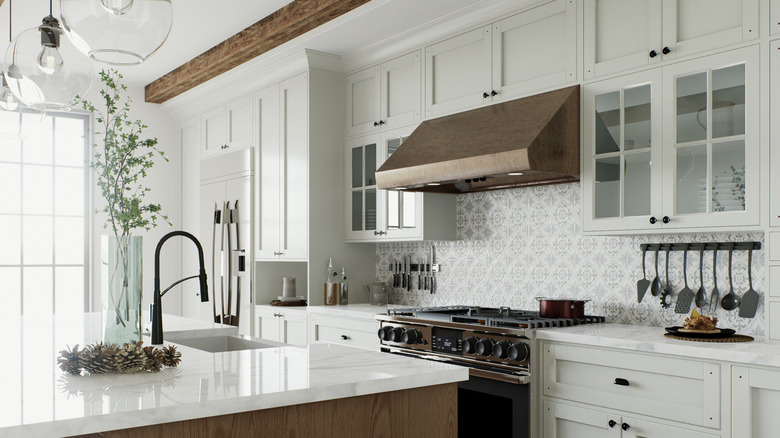
When dreaming about a beautiful and pristine kitchen to cook in, you may immediately think of white glossy cabinets, drawers, and white paint a la a 2000s rom com kitchen. But if you're thinking of renovating or are curious about what decor to look for in your next home, you might want to reframe your thinking. Interior designer Cristiana Crin, founder and director of design of Perpetuum Designs, spoke exclusively to Chowhound about the best colors for a kitchen. Surprisingly enough, white (at least a high gloss shade of it) is one of the worst kitchen design choices.
That's not to say that you can't include white in your design, but Crin recommends a neutral shade — not a high gloss shade, which she says creates the worst look. "A high gloss paint, regardless of the color, is going to be a really bad idea," she said. "A high gloss finish will always create shadows, no matter how perfect your walls are. It will always show imperfections, and there will always be objects in the room that create shadows."
On the other hand, if you go too dark, that isn't going to look good, either. "A general rule will be to stay away from anything dark or oversaturated: dark gray, dark green, dark blue, red, yellow, and anything with a highly intense pigment," Crin advised.
Choosing the right paint colors for the kitchen
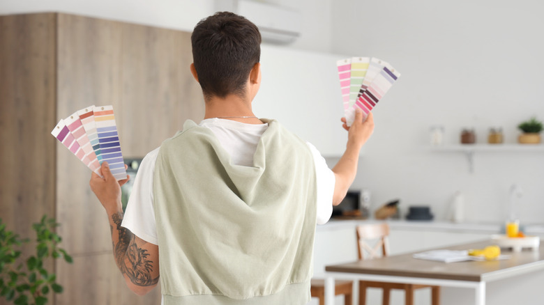
So, what paint color does Cristiana Crin recommend for kitchens? "In general, just looking at pastels or very light neutrals will be a safe choice," she said. "Of course, it also depends on the color of the cabinets. A neutral paint color [is] incredibly easy to pair with any light-toned wood finish in cabinets." You can even update your kitchen cabinets with no paint, if you're interested in giving them a quick new look.
It's also important to consider what style of kitchen you're interested in, which will help you to consider the colors for your space. When looking for an accent color to balance out the neutral, Crin says to follow the 60-30-10 rule. This means that 60% of a room should be covered in a primary color, 30% in a secondary color, and 10% the accent color. "As for choosing the right tone, look at other elements in the room and pick a pigment that will complement," she said. That might be as subtle as a vein in your countertops or a dish you keep out on display.
And if you're ever stumped about the best way to pick the right color, don't be shy at your local paint store. "Your best bet is taking a physical trip to your local paint shop," Crin said. "Choose large paper samples, and bring them home to be viewed in the natural environmental light of the space. Very few people fail when doing this."