7 Old-School Fast Food Logos You Totally Forgot About

Whether you're driving through your hometown or taking an exit off of the highway looking for a quick bite to eat, fast food logos are instantly recognizable. They evoke a sense of familiarity and can even kick up a craving for your favorite drive-thru treat. Logos for stores, products, and restaurants have quickly become a part of the cultural zeitgeist, and it's interesting how we don't often notice when they change. Tweaks to logos are often subtle, allowing for continued brand recognition while still providing a more enticing design — especially because many of today's brands are aiming for a sleek, streamlined look.
Fast food marketing departments have massive budgets to figure out what logo will be most memorable and what will stick out to us among a sea of other choices. Let's take a look at how fast food logos have changed over time — and get ready to be hit with a wave of nostalgia.
Chick-fil-A wasn't always spelled the same
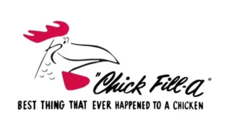
That's right: Chick-fil-A's logo used to have the restaurant's name spelled "Chick Fill-a." It also featured a picture of a rooster and the tagline, "Best thing that ever happened to a chicken." The logo progressed over time into the spelling we know today, but the original rooster is still included — just incorporated a bit more seamlessly into the chain's name.
Burger King's logo used to be super literal
Fans of Burger King have seen many iterations of the logo since the company's inception in 1954, but the oddest version has to be the 1957 version. A literal king (wearing clogs, maybe?) sits atop a meaty Whopper throne while holding a soda that's half the size of his body.
The Carl's Jr. logo was adorable
It was cute back then, and it's still cute now. In the 1940s, Carl and Margaret Karcher invested all that they had in a hot dog cart, and the rest is history. The smiling star logo was introduced a few years later as the couple introduced the first Carl's Jr. restaurants in Anaheim, California. While the star no longer has freckles, doesn't hold a glass, and isn't wearing cowboy boots, it still has the same delightful smile.
The Pizza Hut logo was... confusing at best
Long before Pizza Hut offered a salad bar, Pizza Pete was king. Many of their 1960s-era logos featured the cartoon pizza maker with a mustache, hat, apron, and handkerchief (we're still not sure why your neck needs to be protected when you're tossing pizza dough). Today's Pizza Hut logo is far more minimalistic, with no Pete in sight.
Taco Bell's logo was fit for a preschool classroom
You know those letter blocks that toddlers play with? The old Taco Bell logo looked like a designer got ahold of a few of those and got some ideas. Today's Taco Bell logo is a sleek purple-and-white bell design — nothing like the choppy, funhouse-style lettering that we saw at Taco Bell back in the day.
IHOP's logo was straight-up fancy
The varied fonts, the random capitalization — the original IHOP logo is a site to behold. The restaurant actually went by its full government name from its opening in 1958 until 1973. The name of everyone's favorite place to get free birthday pancakes was shortened to IHOP as a part of a rebranding campaign.
The Golden Arches weren't a part of the original McDonald's logo
No matter where you go in the world, you'll recognize McDonald's by its iconic Golden Arches. However, this wasn't always the case. McDonald's logos of years past lacked the signature double arch that we associate with Big Macs and fries today. The mascot was different too: Instead of Ronald McDonald (who had a 60-year evolution on his own), customers got to see Speedee, a burger-flipping cartoon character named after the chain's Speedee service system. Unfortunately, he might be one of the fast food mascots that you've forgotten, as he was replaced with the chain's beloved clown mascot in 1967.