The Clever Way To Add Dimension To The Dinner Table Using Dishware
So often when we picture place settings that are elegant or sophisticated, we visualize sets of perfectly matched china that share the same color or pattern from serving platter to sugar bowl. While this does create a very clean look that some find appealing, it's far from the only way to dress a beautiful table. In fact, knowing how to mix and match plateware can be a superpower when it comes to designing place settings, as "mismatched" dishware can be just as pleasing to the eye as a consistent china pattern — sometimes, even more so.
When looking at a place setting composed of one color or pattern, the eye processes details very quickly and the complexity of the setting (including all of your effort putting it together) quickly gets lost. A more eclectic blend of hues, prints, and shapes, however, gives your table a more look and exciting feel, and clearly demonstrates the level of effort you put into making everything look just right.
Additionally, mixing and matching your dishware is also a clever way to compensate for incomplete sets (things sometimes break or get lost, we get it), or to stay within budget for a celebration. Instead of shelling out the big bucks for perfectly matched place settings, you can use one of Costco's enormous and fairly priced dinnerware sets as a base and thrift colorful and interesting pieces to intersperse among the plainer dishes, adding a level of character and contrast that you wouldn't get from a uniform set.
Consider color, size, shape, and material
Creating a dynamic place setting with mismatched dishware may sound like a lot of fun (and it is), but with literally thousands of different colors, shapes, patterns, and even materials to choose from, it can quickly get overwhelming. Fortunately, we have the wisdom of experts like culinary and lifestyle icon, Ina Garten, who suggests unifying eclectic place settings with a tight color scheme.
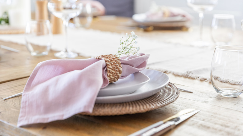
For instance, if you choose pale pink, white, and gold as your preferred colors, you might start with a set of white dinner plates edged with embossed fluting, and layer them together with pink toile salad plates, and solid pink chargers edged in gold. So long as the pinks share an undertone (think warm and peachy or cool and rosy) everything will look like it goes together, especially with white offering a neutral common thread for the eye to rest on. Round everything out with gold flatware and translucent pink drinking glasses to finish the look.
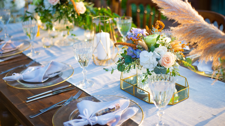
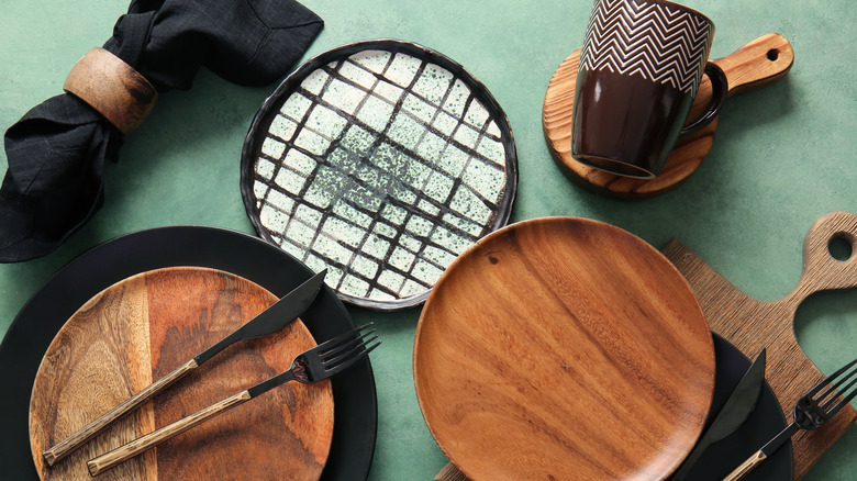
Of course, you can also layer in different materials to change the energy of your table. If you're going for a more relaxed and natural look and feel, wooden soup bowls or dessert plates add grounding color and texture. For a more ethereal vibe, iridescent carnival glass plates layered with solid pieces provide visual interest via the interplay of light and shadow. Try for a new age feel by alternating square and round pieces, or layering together your place settings on top of striking hexagonal chargers.
Edit to keep things elegant
The key to pulling this hack off without things clashing or looking too busy is to edit. While the idea is for your dinnerware not to match, you still want it to be cohesive, ensuring that the mismatched items look purposeful instead of completely random. As mentioned, one way to do this is via a minimalistic color palette, which will keep you on the straight and narrow when thrifting for the right pieces. Instead of being tempted by a wide variety of beautiful plates and platters, you can narrow your focus to just a few things in the right colors.
The same goes for all the other elements in your place setting. If you want to play with shapes, stick to two at most, and try to repeat it in each setting. For instance, if you can only find enough square salad plates for half your setting, make the other half round, and look for square dinner plates to place under the square salad dishes. This creates a broader pattern within your settings that's both visually interesting and logical.
Additionally, if you choose to mix and match patterns, they should share both a color and a theme. For instance, if you're adhering to the mentioned theme of pink, white, and gold and have a set of toile salad plates, look for similarly delicate patterns to coordinate with it. Florals might work well, as would a pretty scrollwork pattern or even delicate paisley, in a pinch.