The 70-Year Evolution Of KFC's Colonel Sanders Mascot
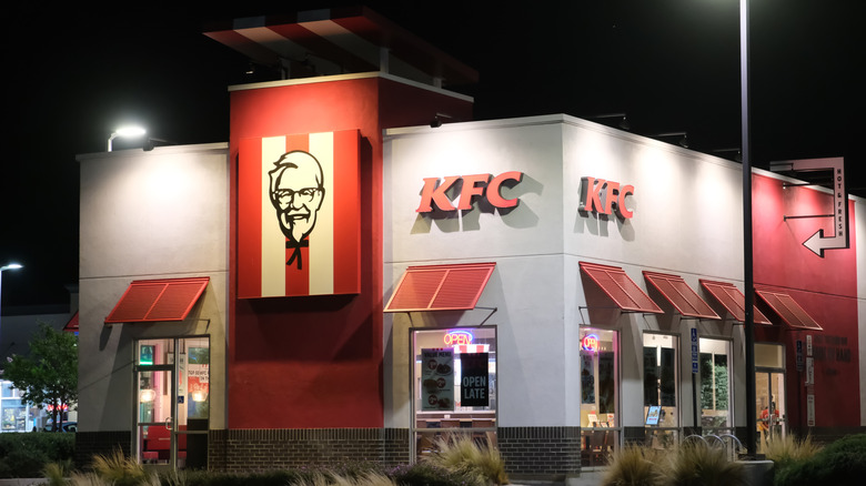
A fast food restaurant's silly mascot may seem insignificant, but when a customer sees it, it can trigger emotions, memories, and even the impulse to go eat there. It's something that a passerby can recognize in any corner of the world, much like if they see one like Ronald McDonald and associate this mascot with eating Happy Meals as a child. Take KFC, for example. The fast food chain has the greatest distribution of its restaurants throughout the world with 30,000 locations in over 150 countries. You'll likely be able to recognize the white and red branding on a trip in China, but what really confirms the identity of the restaurant is the face of Colonel Sanders himself.
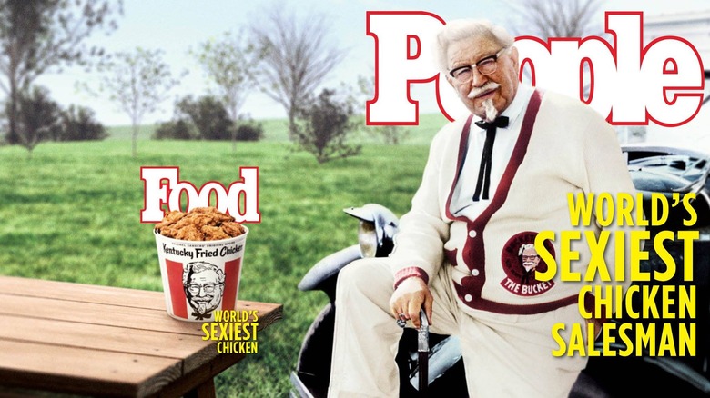
Unlike the mascots of McDonald's and Burger King, Colonel Sanders was indeed a real person with an incredibly interesting life. Born Harland Sanders in 1890, the businessman didn't get into fried chicken until he was 40 years old. After a varied career of serving the U.S. Army and working as a firefighter amongst other odd jobs, he began operating car service stations and serving hungry travelers his special 11-spice fried chicken recipe. Sanders passed away in 1980 at the age of 90 — but his cheery, iconic face will forever live on as KFC's mascot.
His face, depicted typically as a black and white line drawing, remains a core component in all of the fast food spot's designs over the years. That said, there have been some interesting updates over the decades, and even some modern-day celebrity takes on the mascot. Here is how the KFC mascot has changed over the years.
1952: The Real Colonel Sanders
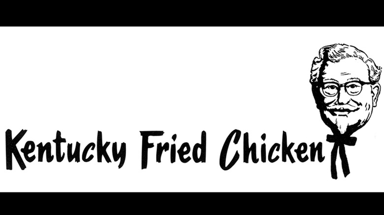
KFC's very first mascot wasn't a cartoon at all, like many others are, but it was the man himself, Harland Sanders. The fast food chain outsourced the design of Sanders' face to a firm called Lippincott & Margulies. He appeared in the earliest ads wearing his signature white suit, black string bow tie at the neck, and glasses, representing the brand's Southern hospitality and family-friendly vibe. His expression is somewhat neutral, but he looks like a kind, approachable grandfather with a goatee and thick mustache. Compared to modern versions you may be more familiar with, the 1952 mascot design includes more facial details and a mix of thicker and thinner lines.
Kentucky Fried Chicken was always written out as the full name, rather than "KFC," in the early years of the chain. The font has more of an artsy personality than the modern, sharper versions, and the name appeared to the left of the mascot.
1978: An updated classic
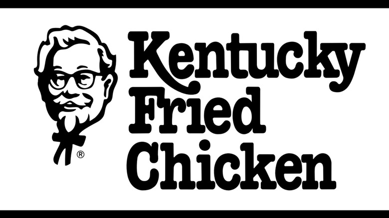
Almost three decades later, KFC introduced a softer, smiling illustration of the Colonel, reducing fine detail in the suit and facial features. The lines are thicker, and it is drawn in more of a simple cartoon style. This version, updated by the same design firm, feels more approachable, likely to appeal to families and a younger audience. The name was moved to the right of Sander's face, and the font switched to a more old-fashioned, classic style.
1991: Adding red to the KFC mascot
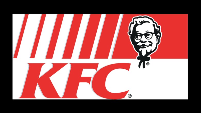
1991 was a big year for changes at the chain. Kentucky Fried Chicken officially rebranded as KFC and color was added to the logo. KFC was a quick, more colloquial way to say the name, and it didn't box the chain into selling just fried chicken. For the rebrand, the Colonel's head-and-shoulders portrait was redrawn with bolder lines and placed inside a red-and-white striped bucket background. In terms of logo design, the '90s were a time of bold colors, sharp geometric designs, and a modern, futuristic vibe, so the updated mascot was an effort to refresh the brand while keeping the Colonel central.
1997: Colonel in color
The 1997 mascot was the most vibrant to date with a red apron, flesh-toned skin, and more vivid detailing. This made the Colonel look more vibrant and visually appealing on signage, especially in the boom of the digital era. The head-and-shoulders portrait, laid in an inclined red trapezoid, made the mascot stand out brighter on billboards and product containers. This version still maintained its nostalgic and traditional components, but with a modern flair to keep Colonel Sanders relevant.
2015-2020: Celebrity representations of the Colonel
KFC made Colonel Sanders more engaging and culturally relevant during 2015 through 2020 by creating celebrity representations in marketing campaigns and commercials. Darrell Hammond first appeared on television in May 2015, with Norm Macdonald comedically saying that he was the "real" Colonel. Rob Lowe appeared in a space-themed ad, shortly before a wrestling-inspired spot featuring WWE stars took his place. Even the late, great Ray Liotta was a dead-serious Colonel at one point. Reba McEntire was the first female Colonel in 2018, and Mario Lopez starred as the mascot in a mini movie in 2020.
2018: A contemporary but timeless Colonel
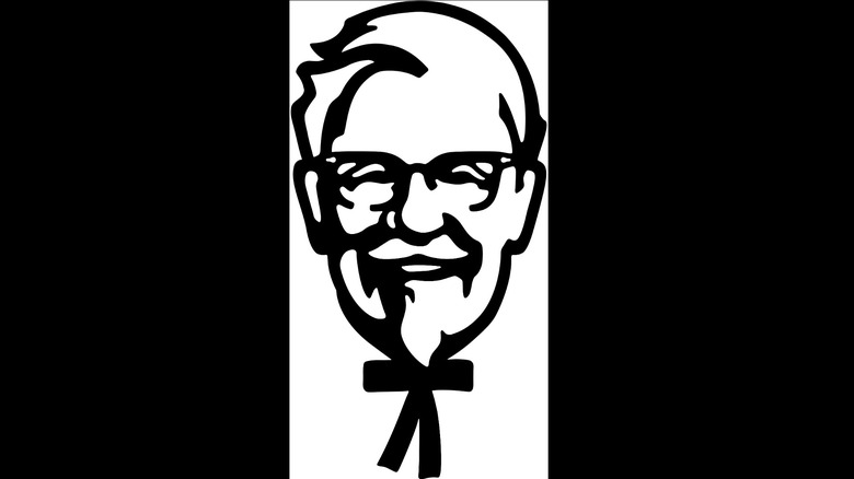
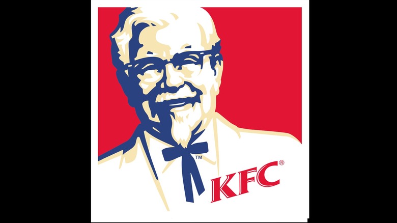
The latest redesign of the KFC logo occurred just a few years ago, featuring an extremely simplified, stylized Colonel Sanders. His black and white portrait highlights the most important elements, the glasses, goatee, and bow tie, so that people cannot miss recognizing him at a glance. The clean and contemporary typeface is placed under the Colonel and easy to read. A minimalistic design such as this works well in digital media, but without losing the core components of the mascot and his long history.
2025: The frowning Colonel, a temporary design
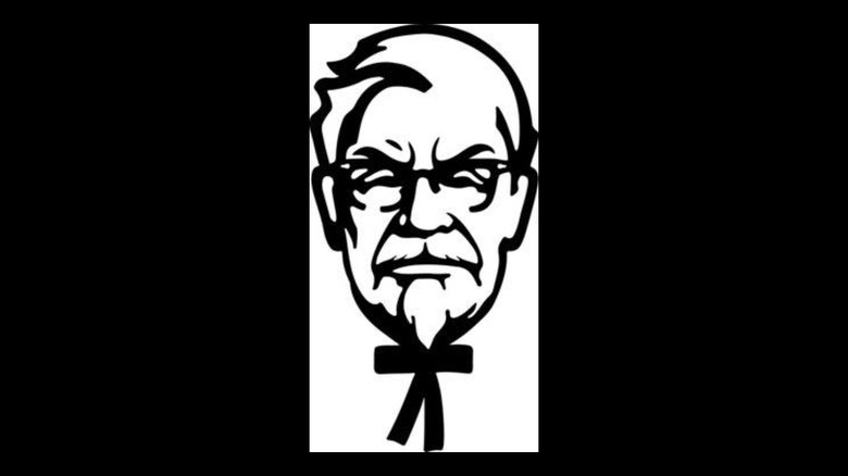
While the 2018 version is officially the most recent version of the Colonel Sander's mascot, the 2025 update is technically the latest design — but it's temporary. You may have seen it and wondered if it was some type of prank, as it features a surly looking Colonel with furrowed brows and a frown. The grumpy grandfather profile is a marketing attempt by KFC to show the company's disappointment in dropping customer sales, in hopes of drawing more business back in. And if you do stop by to appease the Colonel, here's a pro tip to get the freshest meal at KFC.